Here are top techniques to post process your images using Adobe Lightroom. This definitive guide will help you to make your images look awesome for web and print. These Adobe Lightroom techniques will significantly save your post processing time as well.
Here is truth about Digital photography – It is just not enough to capture beautiful image but post processing the image is as important as capturing the image.
There are many people who capture great images and when it comes to organizing and post processing the images they get overwhelmed with different softwares and technical terms.
Many photographers struggle with questions like
- Searching for images is a nightmare! How to store my images properly so that I can get them quickly when I need them, as my client is waiting
- I need to make pictures ready from my latest photoshoot and deadline is coming close, how do I do it?
- I don’t remember what edits I made on this image I want to re-optimize those changes and make the picture better, how I can do it?
- How can I make my images awesome?
- I am not sure which software to use for post-processing
? How to process my images so that they look better?- Is this software right for me, can I do it? and so on
If you are serious and I am sure you do , in creating great images of your subject ; you need to be methodical and systematic in-terms of your Image organization and post processing workflow.
Well, we are going to learn a software and techniques which almost guarantees that quality of your images will improve and your workflow will be faster. These techniques helped me to reduce image post-processing time significantly.
In the early days of my photography I used Adobe Photoshop tool primarily to process images. Image optimization Algorithms for Adobe Photoshop are great. In Adobe Photoshop – Adjustment layer is a great feature for optimizing images in systematic way.
While using Adobe Photoshop I discovered some of the areas where more effective solution was required.
Regarding Image organization, storing and organizing images was difficult using Photoshop. If I wanted to find a particular image captured in a specific year, camera and lens – it was a very time-consuming process. Coming to an image optimization – in order to save which changes were made to the image I have to store .PSD file. Which was filling up my hard drives and Image backup was getting heavier and costlier with these extra .PSD files.
When it came to Image optimization or post-processing If I didn’t have.PSD file which was processed earlier, I have to do the post processing again. This process is not only time consuming but replicating the same results is challenging. In Adobe Photoshop there is no standard workflow which is defined in software. Mostly the workflow is defined by a photographer and not the software. And after 1 year as my workflow was changed and not the same as before. Sometimes I felt totally lost while processing the images on where should I start optimizing an image and how to process it systematically.
Then I came across a tool Adobe Bridge which was used along with Adobe Photoshop. Adobe Bridge is a very powerful tool when it comes to Image organization. It helps in batch processing , Image organization and features like adding watermarks, optimizing colors and applying to multiple images at once.
In a nutshell for image optimization I was using Adobe Photoshop and for Image organization I was using ( sometimes ! ) Adobe Bridge. But being an outdoor photographer where flexibility and creativity in terms of Image organization and optimization are critical; Working with the two
After using Adobe Photoshop and Adobe bridge I came across an Adobe Lightroom. Feature-wise Adobe Lightroom sounded perfect. Adobe Lightroom handles Image organization and Image optimization very swiftly.
The best thing about Adobe L
In fact non-destructive image optimization is a DNA of Adobe Lightroom. Adobe Lightroom console has standard workflow and which generally works best in most of the photography situations.
It doesn’t ends here ! The most Killer feature of Adobe Lightroom is Catalog. So, what is Catalog in Adobe Lightroom ? In Simple words it is a log file or a handy diary of all the image locations and the image edits you did on that image. With the Catalog you will find the required images literally within few seconds. Retouching and editing images is easy as well with the help of catalog as it has all the logs of previous edits.
Catalog makes Adobe Lightroom really Light one ! Once you start using this feature your life will get so much better and image organization will not be a nightmare but sheer bliss !
In a summary
- Non-destructive Image optimization
- Image organisation thru catalog
are some of best features of Adobe Lightroom.
More than just a feature, these are the best strategies in digital post-processing workflow implemented flawlessly by Adobe . I absolutely love these features.
Let’s take a look at how Adobe Lightroom can help you in optimizing your images beautifully yet in an effective way.
There are 7 modules in Adobe Lightroom –
- Library
- Develop
- Map
- Book
- Slideshow
- Web
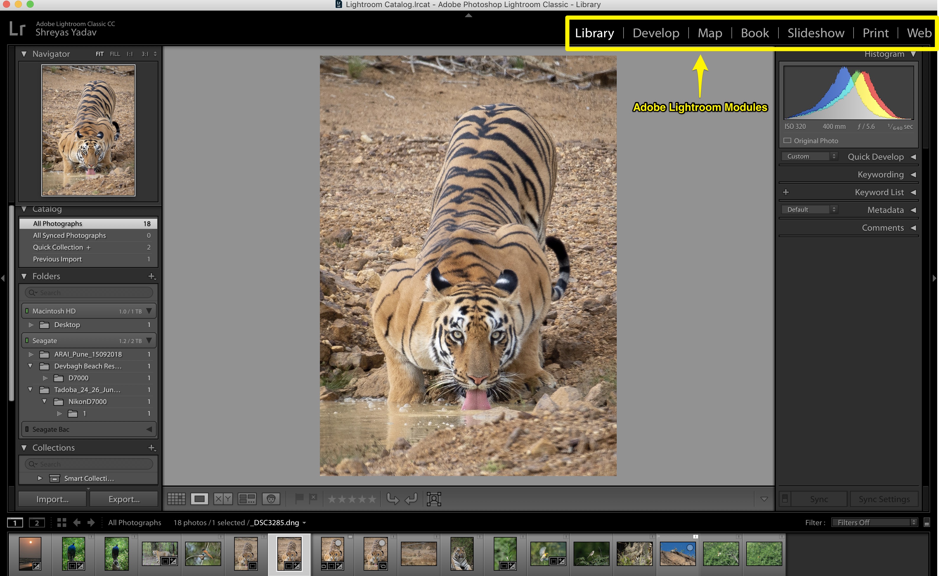
Here is a quick overview of each module. You may not need all the modules every-time. Based on your requirement you can choose which combination of Module you can use.
Library module is used for Importing, organizing and reviewing the images- Develop module is helpful in optimizing or editing the images
- Map module allows us to geo-tag the images, in-case image is already geo-tagged then the location will be visible in the map module
- In the Book module, you can choose predefined book template to make a beautiful book out of your images
- Slideshow module helps in creating slideshow from your images in a creative yet in the quickest way
- Like Slideshow and Book module,
Print module has presets and layouts which are useful in printing images W eb module can help you in creating images which are web friendly and you can upload these images to a web in a user-interactive way
Most commonly you will use Library and Develop module with combination of one another module.
Library and Develop modules are the most useful modules. Learning them can reduce your post-processing time as well as you will be able to optimize your images effectively.
Library module
Let’s start with the first module of Adobe Lightroom which is a Library module.
Here are some of the useful features from Library module. It will save
- Catalog
- Metadata
- Searching images using metadata
Catalog
Catalog file
Hence whenever you want to find and edit your images, simply pull out this digital diary. With the help of catalog you will find the images quickly and edit or re-edit the images in develop module.
If you have this catalog file backed up, your workflow will not get hampered even if your adobe lightroom or computer crashes. You will have all the details stored in
Metadata
Catalog file has image metadata. Metadata will have details about the image such as date, time, camera, lens, EXIF data and if available then location as well.
Metadata is useful in finding the required images based on date , camera, lens and many other parameters.
Metadata also has EXIF d ata of the image. This helps in evaluating the images based on the image setting such as Aperture, Shutter Speed and ISO etc.
Searching images using metadata
Here is a screenshot about how you can find the image based on metadata. You can find an image based on which camera and lens you used or based on month/
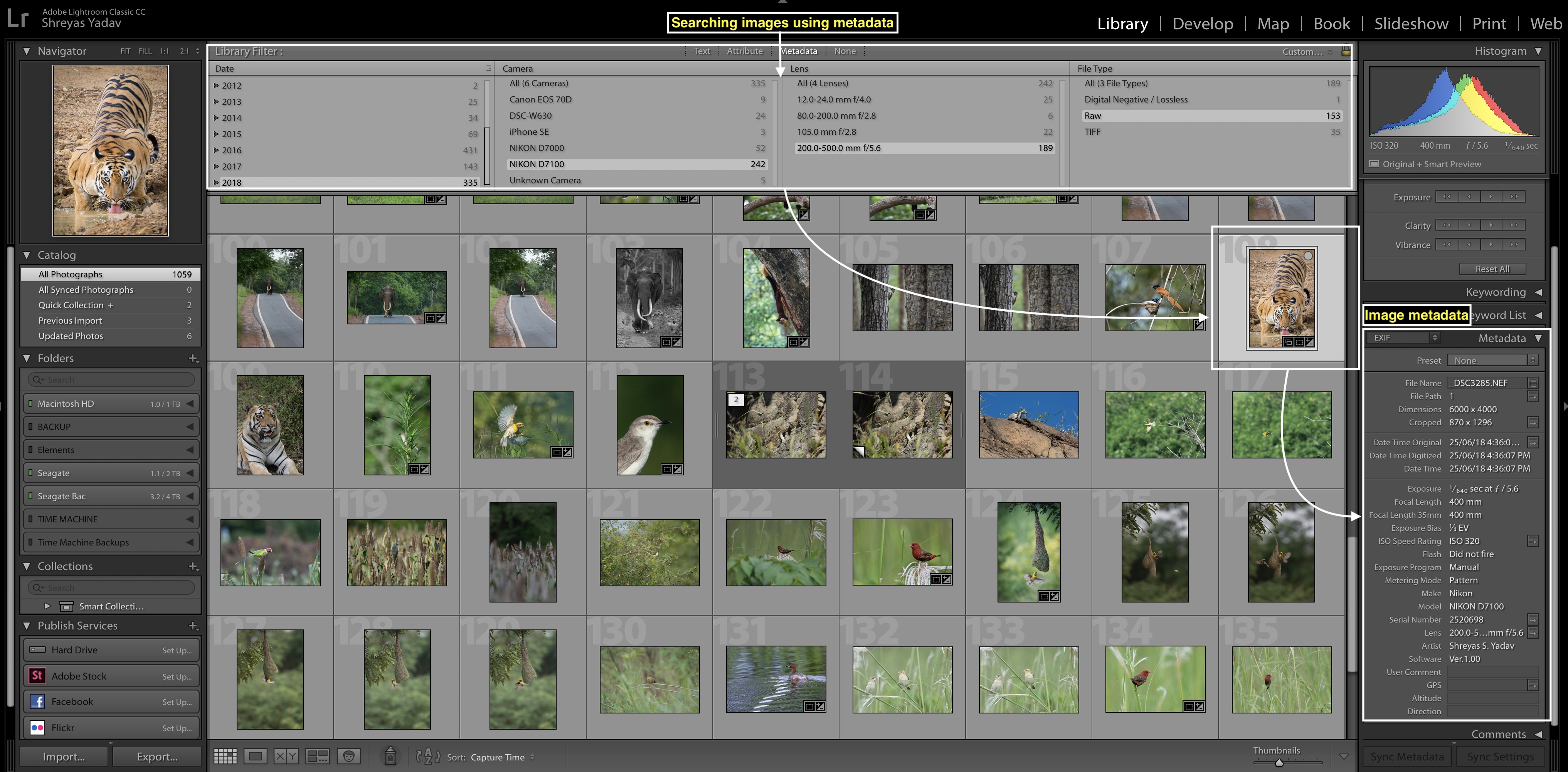
Let’s say you have photographed graceful male tiger from Bandhavgarh, India. You already have imported and edited the Tiger image in your Adobe Lightroom catalog. Now you are looking for that Image as you want to send it to photo competition or share a portfolio with your client.
Here we go, you roughly remember which year it was photographed hence select the year. Mostly you will remember which lens and camera
Now you can filter images based on particular month. Hence out of 100 images you will funnel down to 20 images. And from 20 images it is easy to find your favorite Tiger i mage!
This is
Once you start using this feature you will be ama zed how fast and efficient this method is to find your images than any other manual method. Start using it for some-time and you will start noticing how much time you are saving!
I personally use above mentioned features from Library module most of the time. I highly recommend you to start using these features. Your image structure and Image organization will get easy and convenient, saving you a significant amount of Time!
Develop module
Here are
- Crop
- White balance
- Black and White point
- Shadows and Highlights
- Vibrance and Saturation
- Noise reduction
- Sharpening
- Selective adjustments
Crop
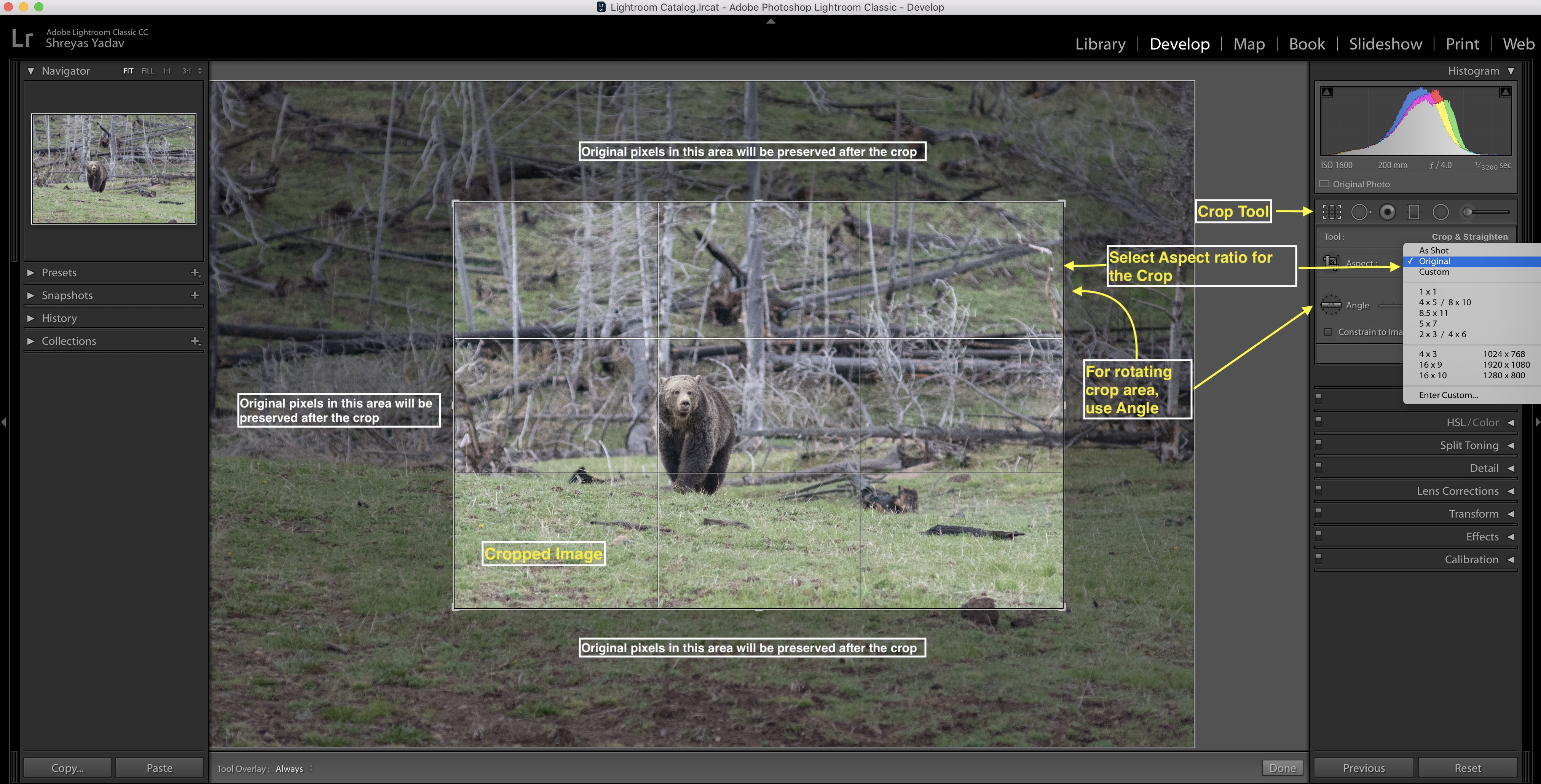
First step while editing an image is Crop. Based on the visual appeal of an image I crop the image. Crop presets are available for standard sizes such as 4” x 6” and 5” x 7” and few more. You can free crop as well ( While using free crop – crop size will not be constraints to standard sizes)
Once you crop an image, original pixels or data is still available. You can always go back and change the crop size or crop area at any point of a time in
White balance
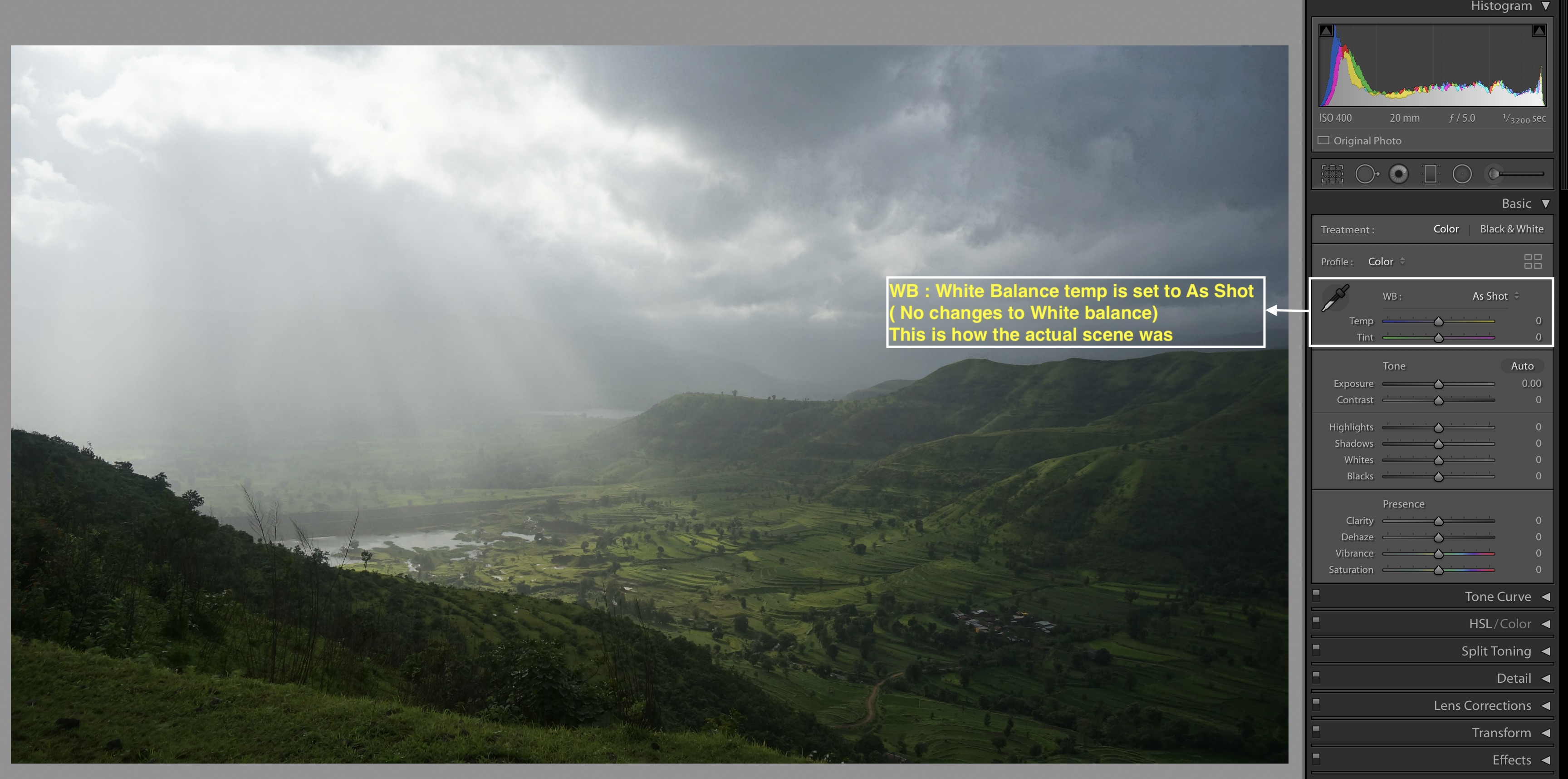
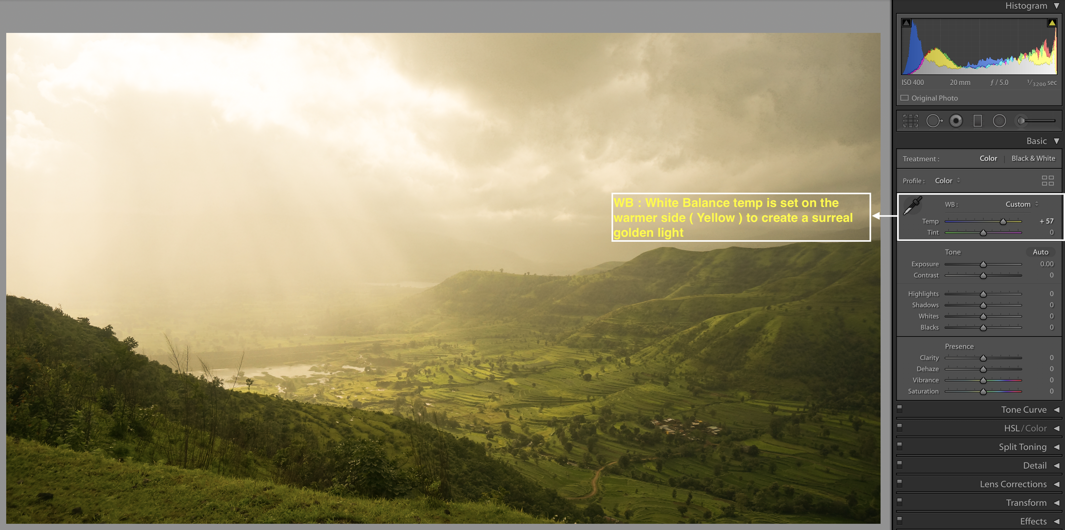
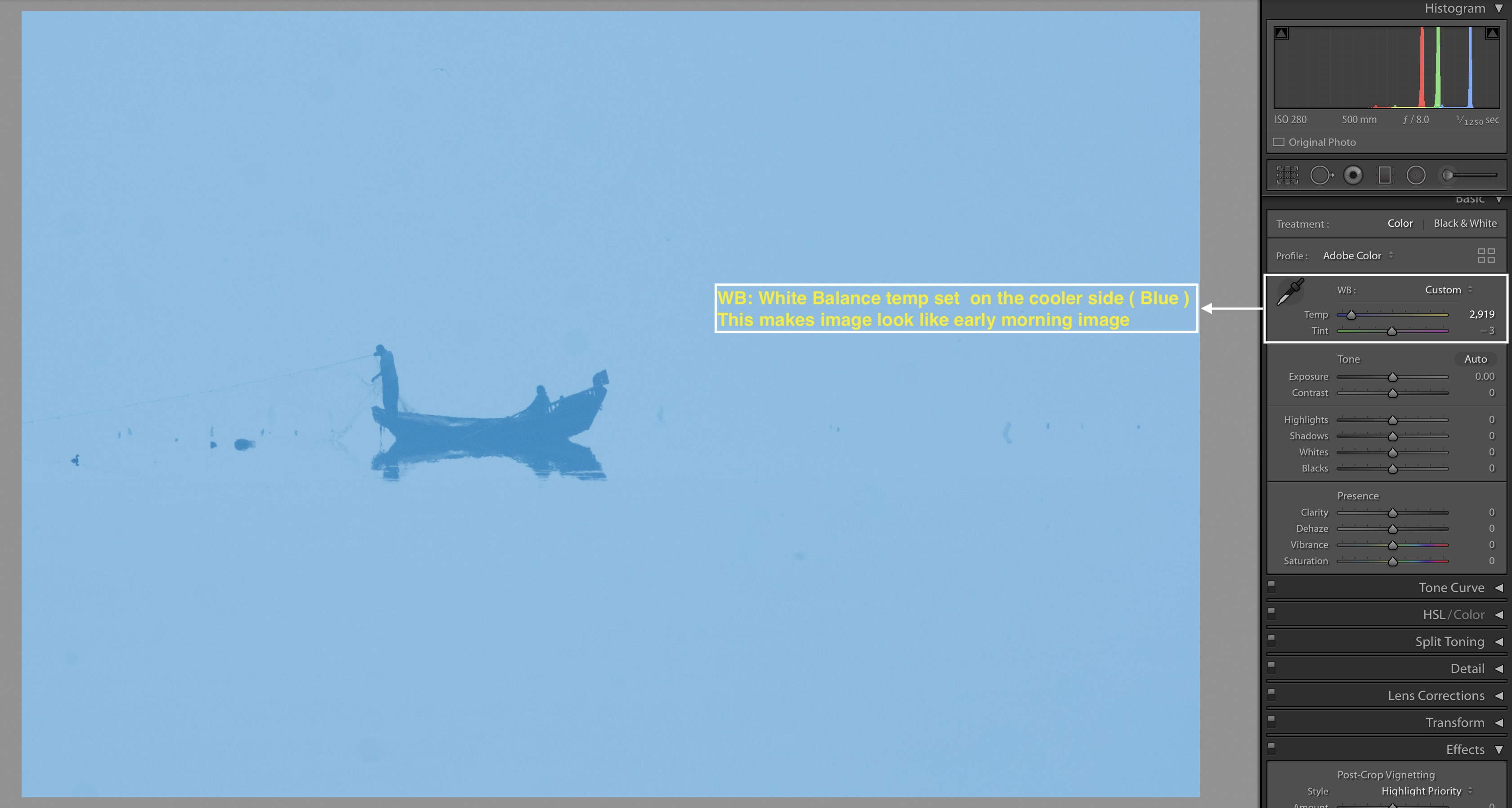
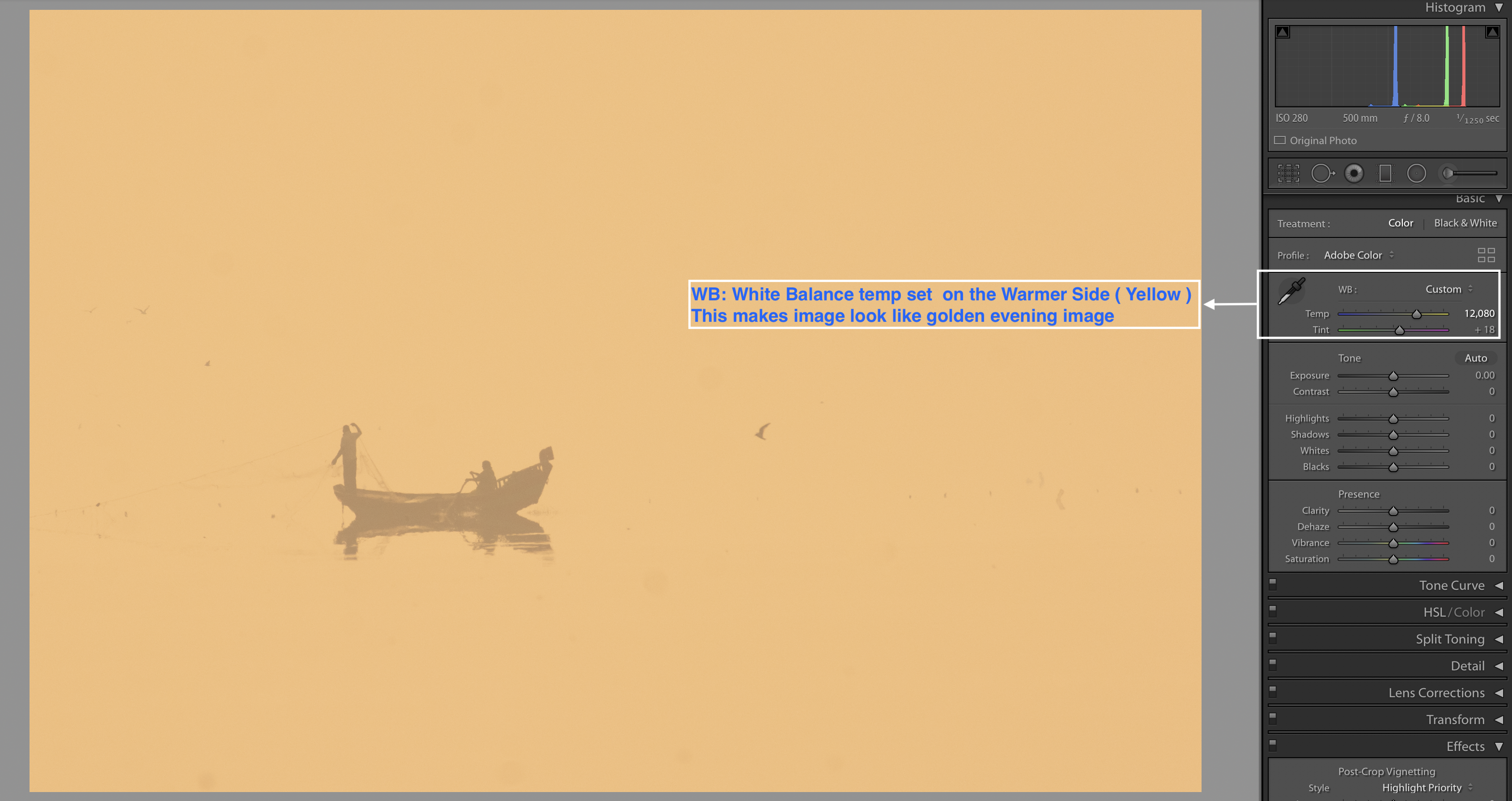
White balance slider is used to adjust the color temperatures in the image so that it looks natural. By adjusting the white balance you can make your images truly realistic . On the other hand you can make an image dramatic as well.
Light sources present in the outdoor ( Sunlight, flash) and indoor ( Bulb, flash) they have
This color cast is removed using White balance slider. In Adobe lightroom there are standard presets available for white balance. In the white balance option, as you click drop down in front of WB: you will see these standard presets.
Next slider is temperature slider ‘Temp’ – with temperature slider you can adjust color temperatures. With ‘Tint’ slider you can remove/add Green/purple tint in an image.
These presets are good to start with. Once you select these presets you can fine tune the white balance by adjusting color temperature.
I follow method below –
- In the standard presets I select ‘Auto’ white balance
- Then I fine tune the color temperature using ‘Temp’ slider
- If there is any tint in the image, I correct that tint as much possible using ‘Tint’ slider
With these steps, you can produce naturally looking images. Which means that your image will be close to the actual scene as you have observed and photographed.
Don’t limit yourself in creating only ‘Natural’ looking images. You can get creative and add dramatic effects to your images by swinging the white balance slider. Just make sure you don’t overdo it. As it may induce artificial colors and most importantly your image will lose a charm.
White balance tool is great in making your images natural as well as dramatic.
Black and White point
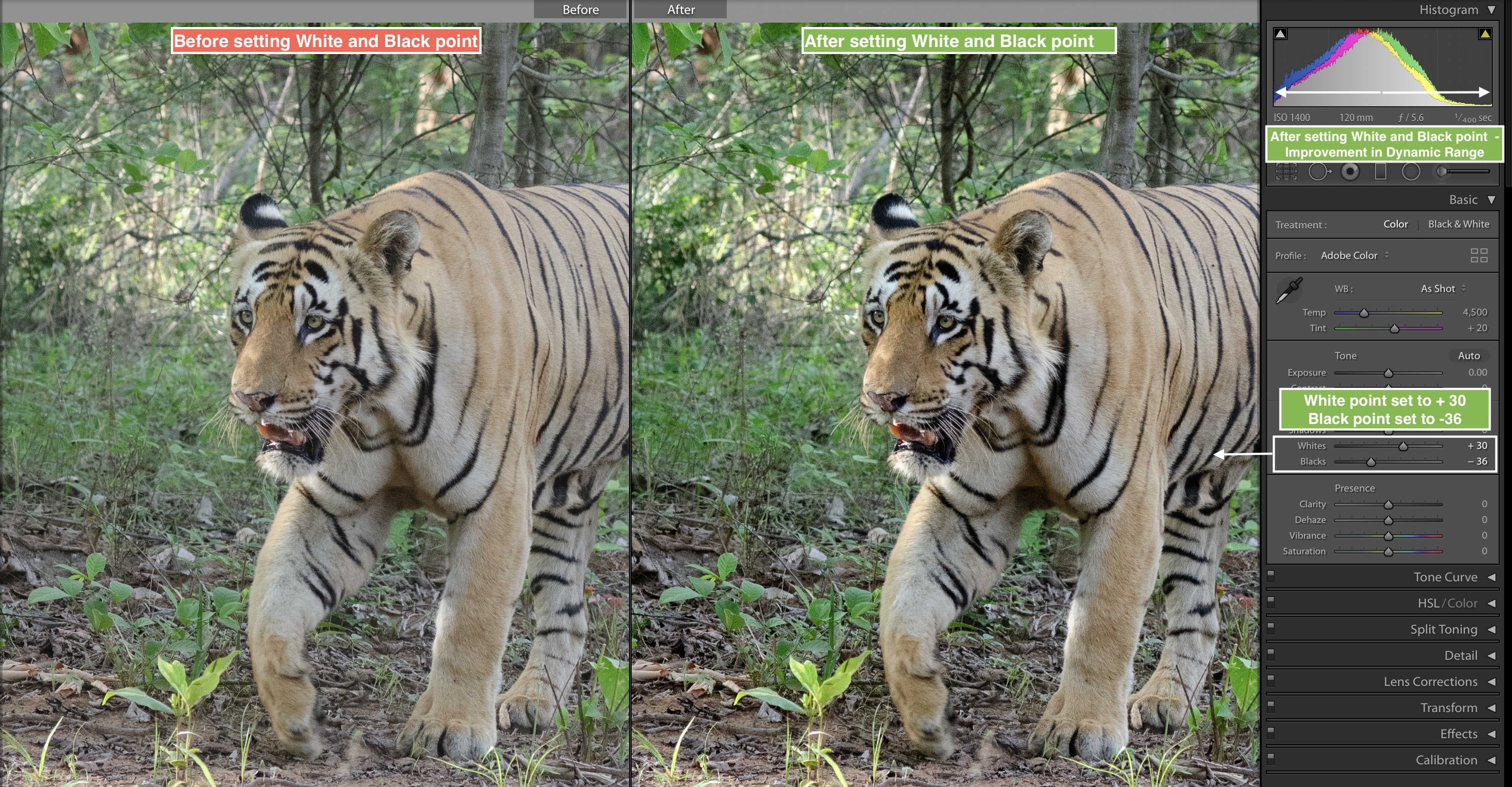
Black and White point slider are used to set brightest and darkest pixels. These extreme pixels define the extreme points of your image histogram. By adjusting white and black point in your image you are adjusting the ‘Dynamic range’ of an image. In most of the cases we try to increase the dynamic range of an image.
In simple words, with black and white point slider you define which is the darkest and brightest pixel/area in your image.
- Setting up
white - Click on White point slider
- Press ( Option/Alt ) key
Image - Move the slider towards
right - As you start seeing first bright pixel/area in the complete black image that is your white point. Stop at this point, this is
white
- Setting up
black point –- Click on Black point slider
- Press ( Option/Alt ) key
Image will be completely white- Move the slider towards the left ( negative number ) until you see first darkest pixel
- As you start seeing first dark pixel/area in the complete white image- that is your black point. Stop at this point, this is
black point for the image.
With black and white point setup properly, you will start seeing realistic and well balanced exposure levels in your images. Black and white point sliders will also improve dynamic range of the image.
Shadows and Highlights
In your images there will be areas which are dark and bright. That is inherent part of any image. Direction of the light and shape of an object creates areas with shadows and highlight.
Shadows and highlight add a life and drama to the image.
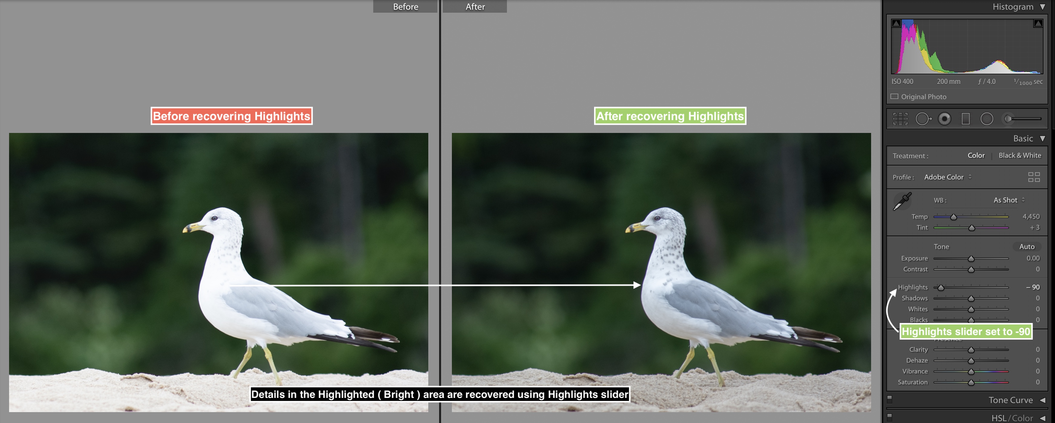
However, in some cases shadows are so dark and highlights are too bright that we need to pull out the details in that area. Shadows/Highlight slider helps in recovering the dark and bright areas of the image. ( Provided while capturing the image, those bright and dark pixels should be recorded. You cannot recover anything which is not actually photographed )
With highlight slide r, you can recover details in the bright areas whereas with shadow slider you can recover details in the dark areas of the image.
- Highlight slider
- Click on the highlight slider.
- Drag the slider towards
left ( negative number ) and you will see details in the bright areas are revealing - Drag the slider towards
right ( Positive number ) and you will see bright areas are becoming further bright, which is not intended in most of the scenarios
- Shadow slider
- Click on the shadow slider.
- Drag the slider towards
right ( positive number) and you will see details in the dark areas are revealing - Drag the slider towards
left ( negative number ) and you will see dark areas are becoming further dark, which is not intended in most of the scenarios.
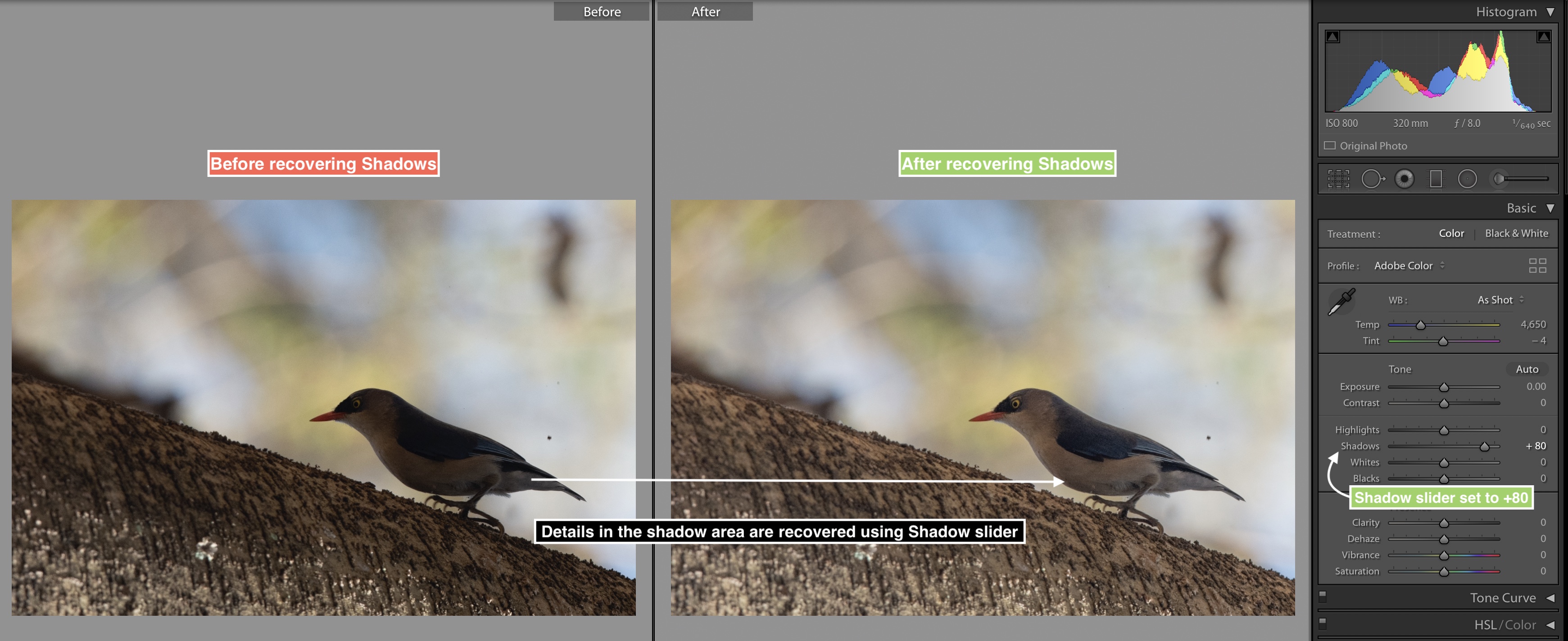
Highlight / Shadow slider affect the overall image. This is global setting and not the localized correction. When you want to recover overall highlights and shadows in the image use this slider. ( Adobe Lightroom detects dark and bright areas where this setting needs to be applied correctly in most of the cases)
I use this slider in some of my images where I need to recover highlight and shadows . Though I apply this settings in moderation. If you overdo Highlight/Shadow recovery you will see halo effect around the edges in your images. Hence moderation is the key for Highlight / Shadow slider !
Vibrance and Saturation
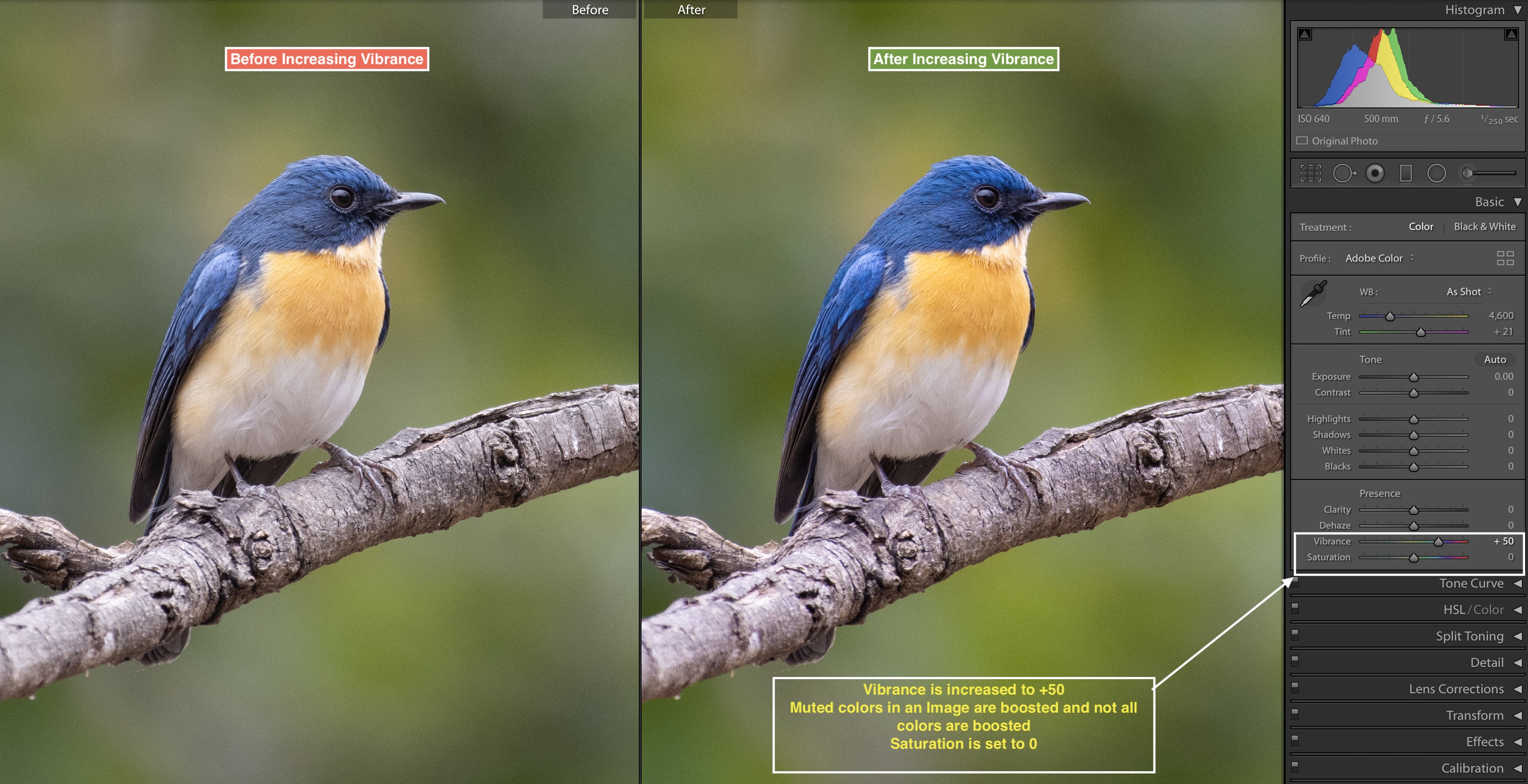
You are gonna love these sliders, yes they int ensify/boost the colors in the image. Especially the Vibrance slider.
Let’s start with Saturation slider and onc e we understand Saturation slider we will look into benefits of Vibrance slider over saturation slider.
As you increase the saturation towards right ( Positive number ) then all the colors in the image starts to intensify. Saturation slider affects overall colors in the image. What saturation slider does is, whichever colors are dull those colors are boosted but the colors which are already bright, they will be further boosted. Many times this effect can give a perspective of artificial colors and artificial image effect. When you are editing portraits, where you want to protect the the skin tones, in that scenario Saturation slider has its limitation. Saturation of the skin is changed which is not desirable. Hence for portraits Saturation slider has its own limitation.
How to use the Saturation slider –
- Click on the saturation slider, drag the slider to the right ( Positive number ), all colors i n an image will be boosted.
- Now drag the saturation slider towards left ( Negative number ), colors in the image will be muted and intensity of the colors will start to go down.
Compared to Saturation slider,

How to use the Vibrance slider –
- Click on the
vibrance slider, drag the slider to the right ( Positive number), less bright colors in the image will start getting boosted with less effect on colors which are already bright. - Move the slider towards
left ( Negative number) and you will start noticing the colors which are less bright will get further muted and less intensive.
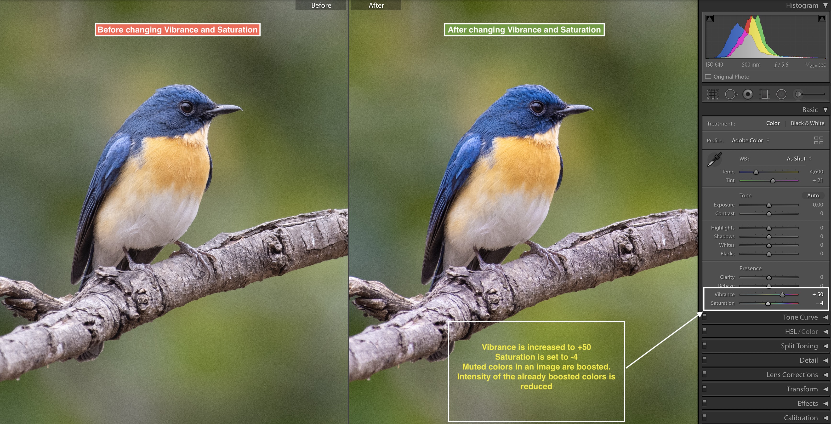
How to get maximum out of Saturation and Vibrance slider –
- Use the Vibrance slider first. Move the slider in right (Positive number) direction until you get desired boost for the colors in your image
- Use the Saturation slider second. Move the slider towards
left ( Negative number ) direction abit . ( Saturationslider : – 1 to -7 will help in most of the scenarios )
What actually we are doing here is, with Vibrance slider you are boosting the colors which are less bright or intensive. And with saturation
HSL – Hue , Saturation and Luminance slider
When it comes to controlling the colors of your images, HSL slider works effectively.
What is HSL ?
HSL is a set of sliders for various colors which controls Hue, Saturation and Luminance.
Hue – Every color has shad es. Hue controls a shade of the color. Hue slider helps is setting up the shades.
Saturation – Saturation intensifies or mutes the color. Increasing saturation boosts up the color while desaturation can make the colors dull.
Luminance – Luminance is relative brightness of the color. Increasing luminance of a color makes the color appear bright. On the other hand reducing luminance will make color to appear as dark.
In the HSL panel, primarily there are 8 colors. For each color you can control Hue, Saturation and Luminance independently.
How to use HSL sliders –
By default all the sliders are set to 0 . Moving slider towards right ( Positive number ) will increase the Hue, Saturation and luminance . As you drag the slider towards left ( Negative number ) Hue , saturation and luminance will be reduced.
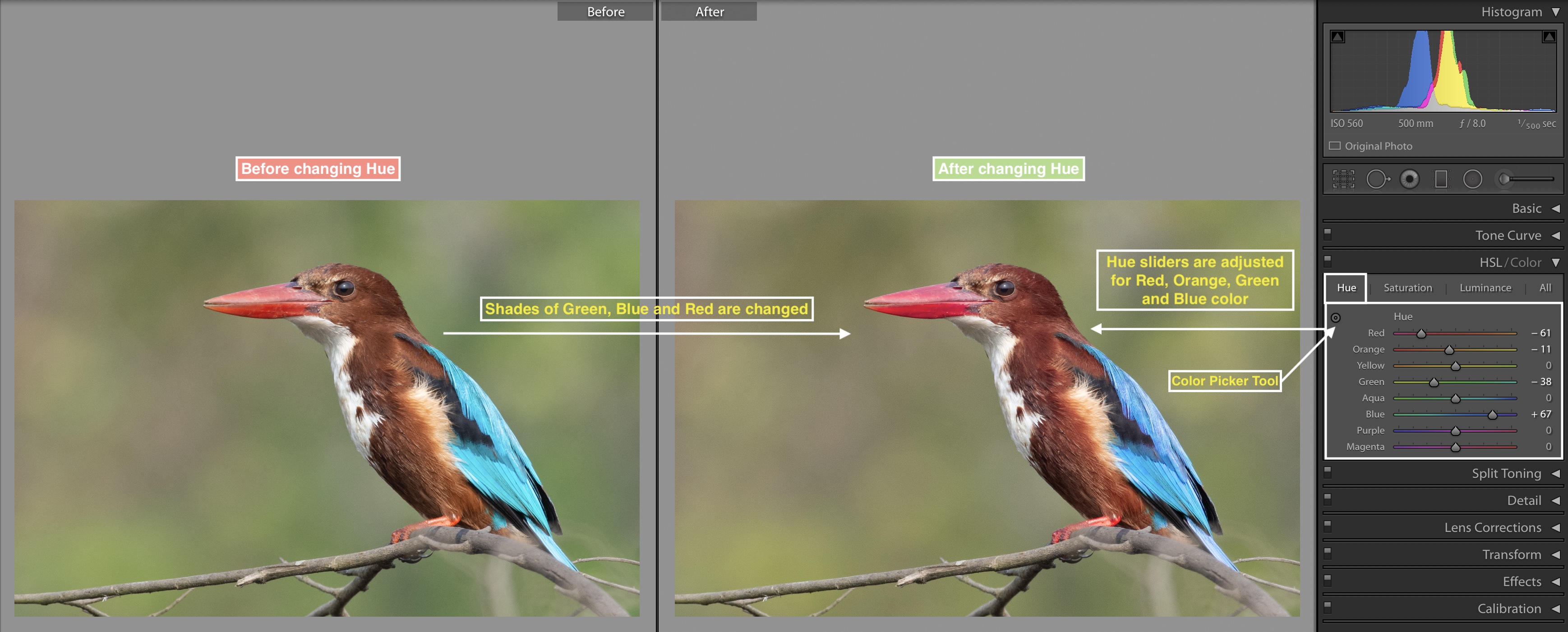
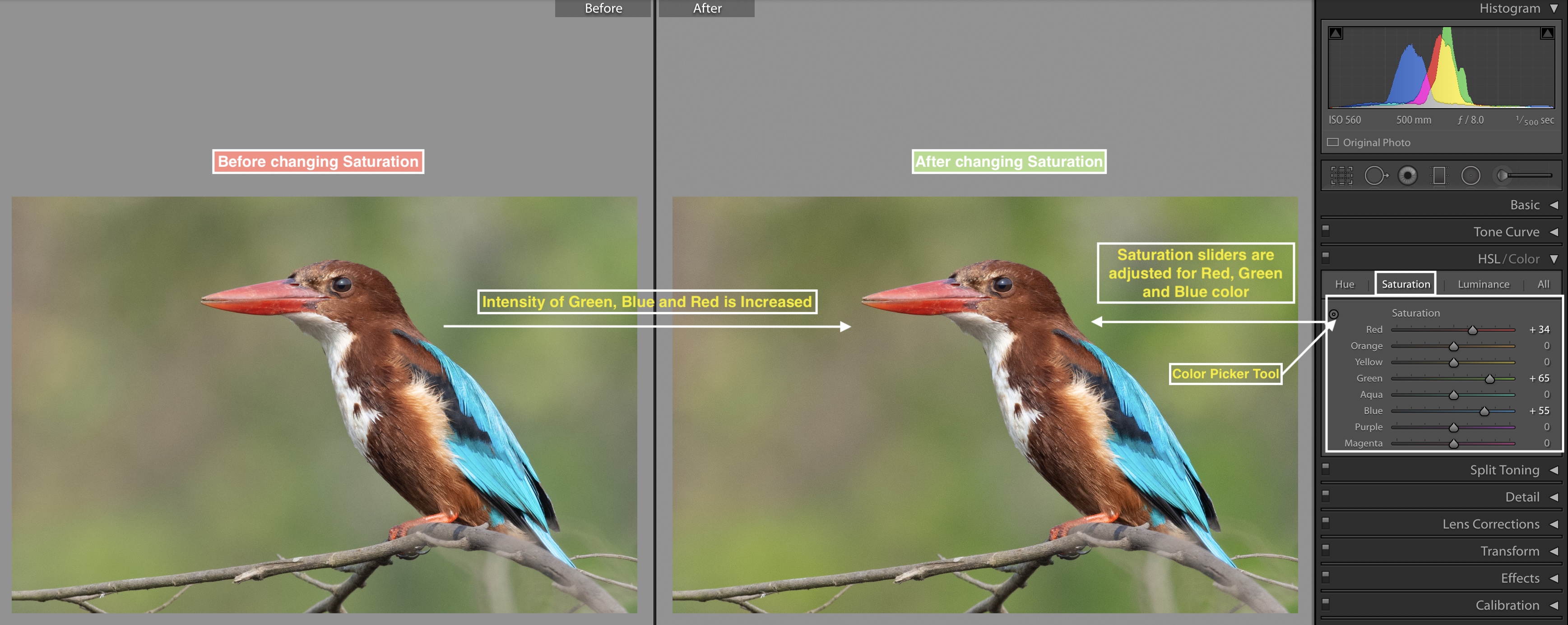
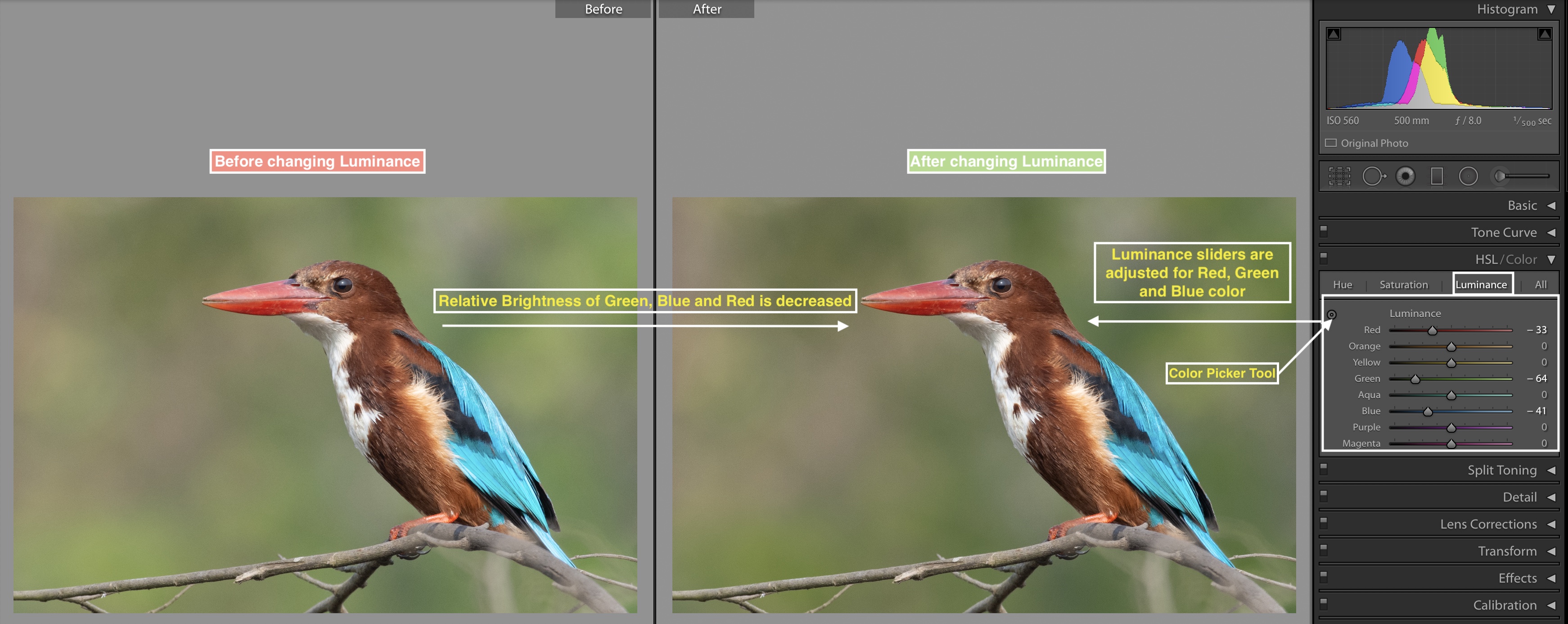
Similar to colors, HSL toolbox is great for Black and white images as well. The only thing about
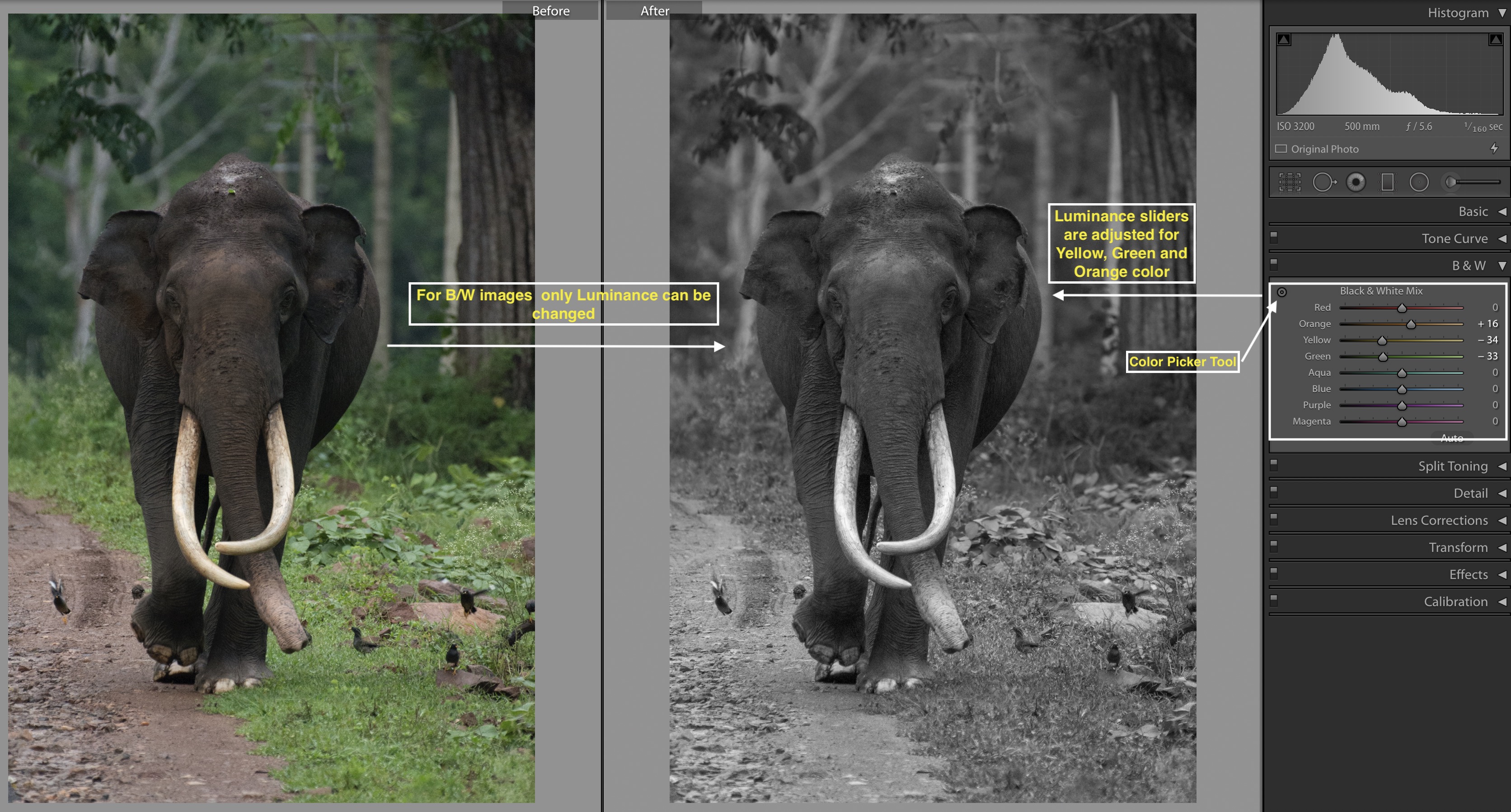
Here are some of the steps which I follow while using HSL tool box. Feel free to use these steps as a good starting point and tweak it as per your image requirements.
- In most of the cases my camera will capture the colors accurately, hence I rarely to uch the Hue slider. Check your image and if you see that the color shades are shifted then you can tweak the Hue slider for that color slightly.
- But don’t limit yourself and use Hue slider to purposefully shift the colors. Use Hue slider as a tool to create realistic and creative colors.
- Whichever colors you want to boost specifically, increase the saturation of that color using sliders ( or using color picker tool ). Similarly, you can mute some of the colors by applying desaturation for those images.
- Evaluate which are the main colors for your object. Increase the luminance for those colors. Also, you can reduce the luminance for the colors which you want to be dark.
As I said earlier, these are good starting points for you. Start here and tweak your HSL sliders as per visual appeal of an image.
Noise reduction
Image noise is a good old friend of photographers and almost everyone hates it! With higher ISO values Image noise becomes visible in the Image. Adobe Lightroom is decent in reducing the noise. I use Adobe Lightroom for noise reduction for most of my images. ( Note – Sometimes depending on the noise, I also use
Primarily there are two types of Noise in an image.
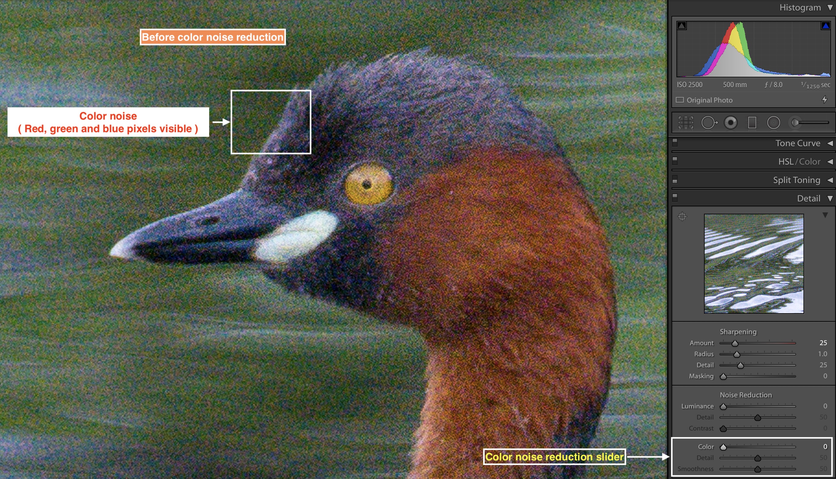
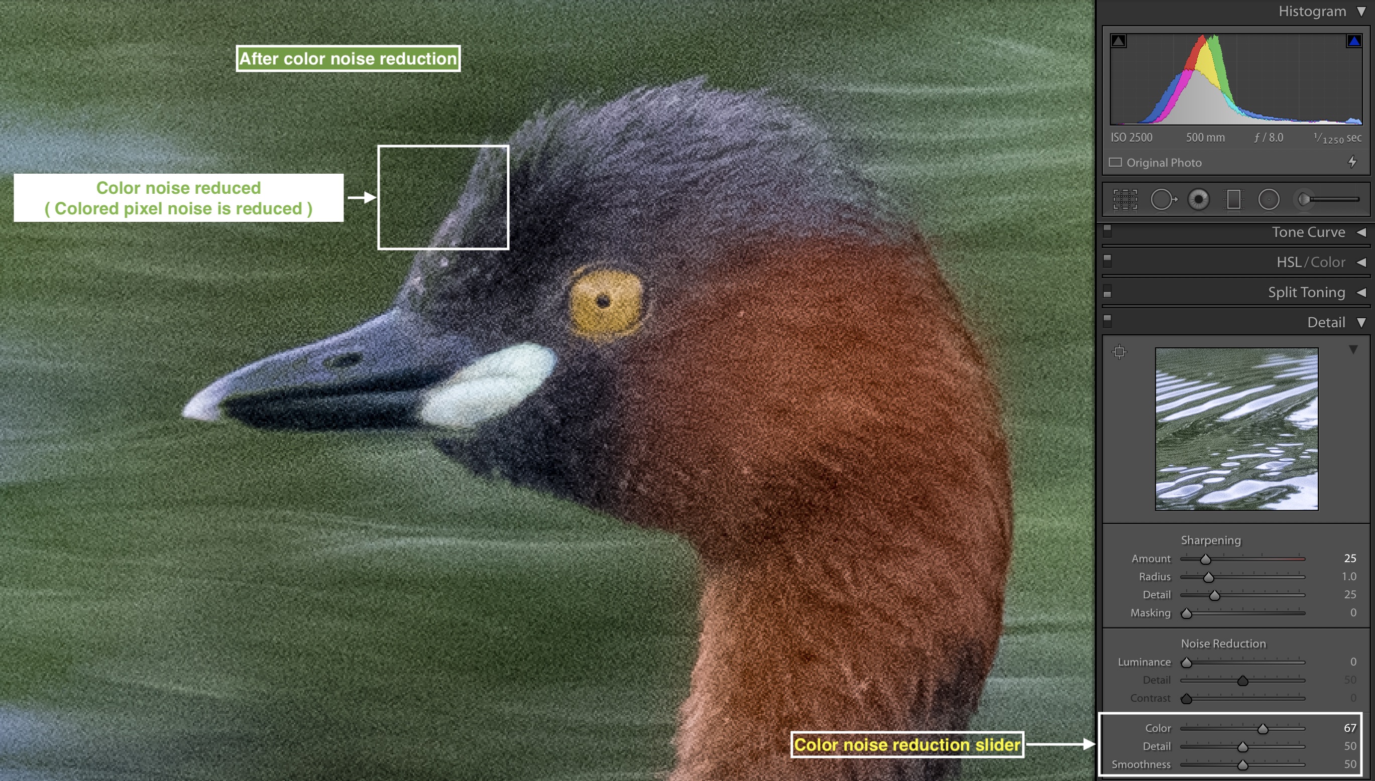
- Color noise – You will see colored pixels such as red, green and blue ( even on, uniformly colored object ) – this is a Color Noise.
- Luminance noise – Image ( or part of an image) appears grainy, this noise is
referred as Luminance noise.
Steps for reducing the noise –
- For effective noise reduction, do consider following points –
- Evaluate which type of noise your image has – is it a Color or Luminance or both?
- Excess Noise reduction may impact visual appearance and quality of the image. Balanced and realistic approach will help you in
reduction of noise and preservation of an image quality
- Color Noise reduction –
- There are 3 slider under color noise reduction – Color , Details and Smoothness
- Color slider defines with what intensity noise reduction has to be applied. Drag the color slider towards right and color noise reduction will be stronger
- Details slider helps in setting up the threshold. If Details slider is set to high value the details in the color will preserved especially at the edge of the color. But over increasing details slider will remove color smoothness
- Smoothness slider helps in preserving the the smoothness of the colors. Where there is transition in colors then smoothness slider helps have have this transition
- Luminance noise reduction –
- Same as color noise reduction slider, luminance noise reduction comes with 3 sliders – Luminance, Details and contrast
- Luminance slider controls the degree to which Luminance noise reduction is applied. Drag the slider towards the right and you will see luminance noise reduction will be applied strongly
- Details slider controls the threshold for luminance noise reduction. Detail slider help in preserving some of the details which are lost due to Luminance noise reduction
- Because of luminance noise reduction, there is a loss in contrast. Contrast slider helps in preserving some of the contrast in the area where noise reduction is applied
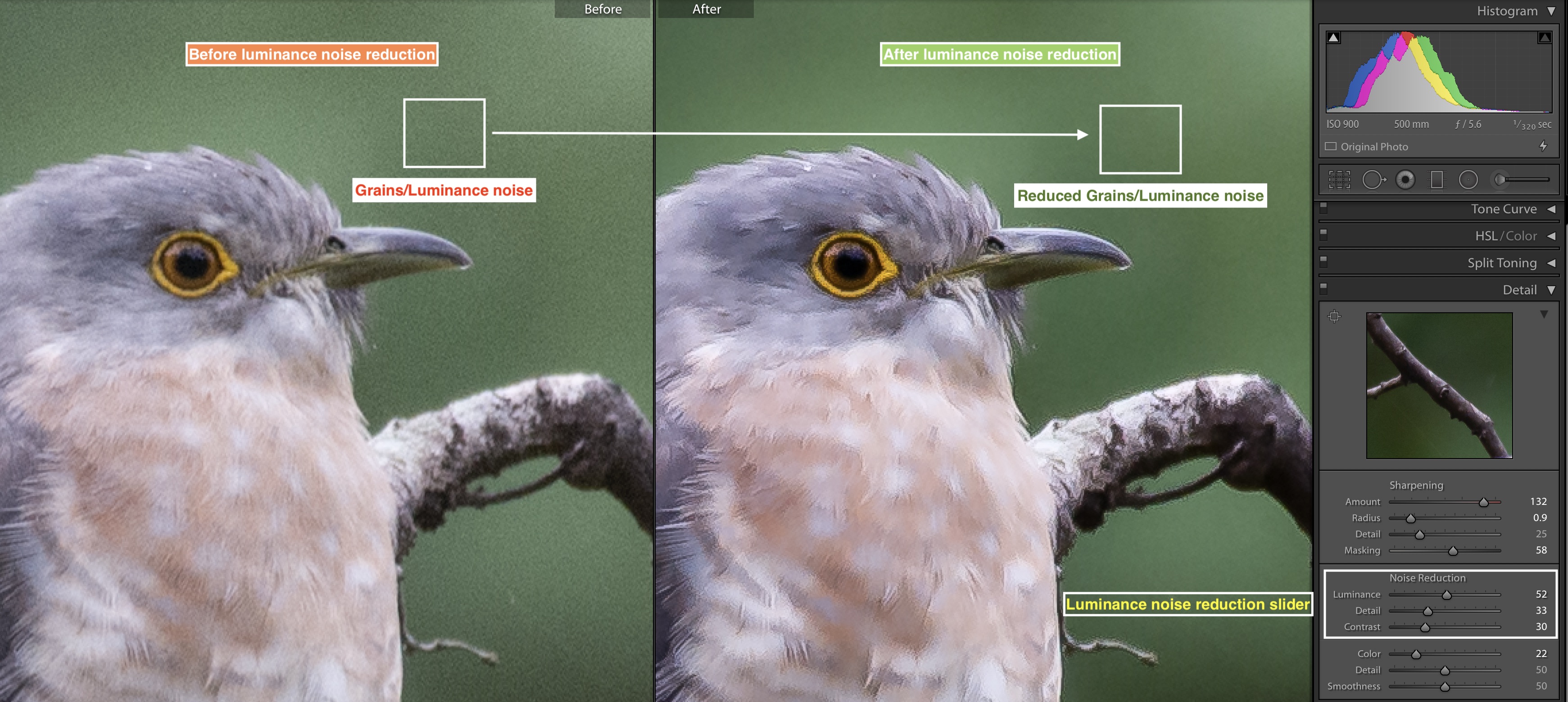
I usually apply Luminance noise reduction and based on an image I choose the setting for each slider. For the raw
Sharpening
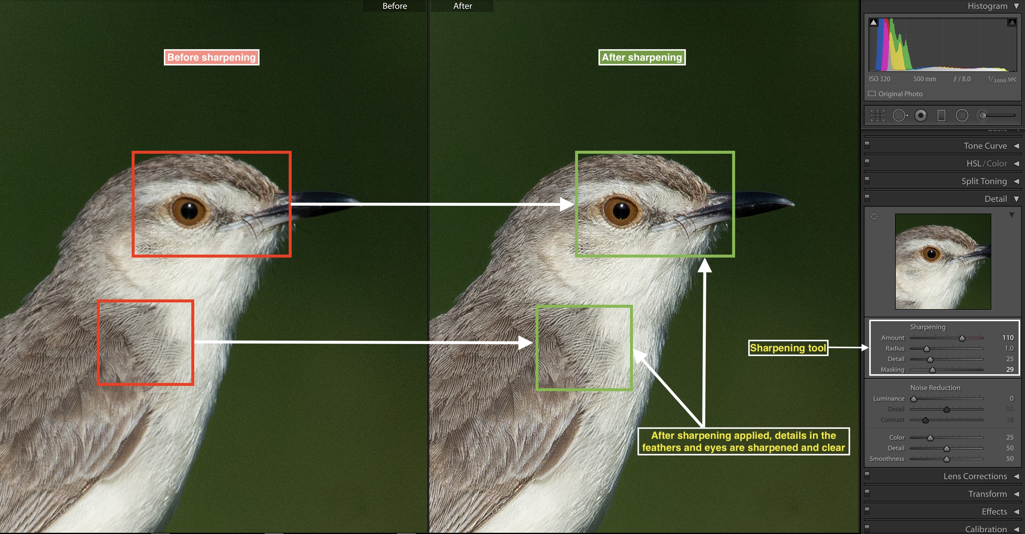
I use Image sharpening as a final adjustment. After all color and exposure corrections are done I apply ima ge sharpening. There are four sliders in the Sharpening tool –
- Amount
- Radius
- Details
- Masking
Here is how you can use these four slider for image sharpening.
- Amount – Click on the Amount slider and drag the slider towards the right. As you increase the Amount, the amount of sharpening applied will increase. An image will get sharper. I use values for Amount from 70 to 120. This range of sharpening you can start with and adjust according to your sharpening requirement for an image.
- Radius – Radius essentially defines how much area to be sharpened on
Pixel level. If you set a value to 1 then sharpening will be applied to 1 pixel. If you increase this number usually the sharpening is not so effective and looks harsh. I keep the radius value from 0.6 to 0.9. Lower the radius number, details will be revealed sharply. - Details – Details slider controls how much you want to render the details sharply. Details slider basically works at around edges in an image. If the details slider is increased fine edges will be sharper. If the details slider is set to lower values, in that case, major or prominent details will be sharp. In most of the scenarios, I choose a value of 25 for details slider.
- Masking- You will love this feature! You can quickly select which area to be sharpened and which
area not to be sharpened. Press (Alt/Option ) key and increase the masking slider towards the right. When Masking value is set to 0, sharpening will be applied to complete image. As you increase the Masking slider towardsright by pressing Alt/option key you will notice the areas which are already in focus are white ( This is where sharpening will be applied ) and the areas which are out of focus are black ( Here no sharpening will be applied )
Masking is one of the best tools you will find in adobe lightroom. If the object is accurately focussed and the background is not in focus, in that case, masking does an excellent job for sharpening an image.
There is no standard value for masking , you can choose the masking values based on image and which area you want to sharpen in an image.
Selective adjustments
In the Adobe Lightroom, selective or localized adjustments are easy to apply. You don’t need to be proficient in the tools such as selection areas and layers like Adobe Photoshop.
There are 3 ways you can apply Selective ( Localised ) adjustments
- Adjustment brush
- Graduated filter
- Radial filter
You can use all of 3 options or any of them. In most of image adjustments I find Adjustment brush useful for localized adjustments. ( I do use Graduated filter ad Radial filter as and when required )
Let’s look into how Adjustment brush can help you to make localized adjustment effectively.
Primarily there are two steps –
- Selection of the area where adjustment needs to be applied
- Application of actual adjustments such as exposure, contrast and saturation etc
1.Selection of the area where adjustment needs to be applied –
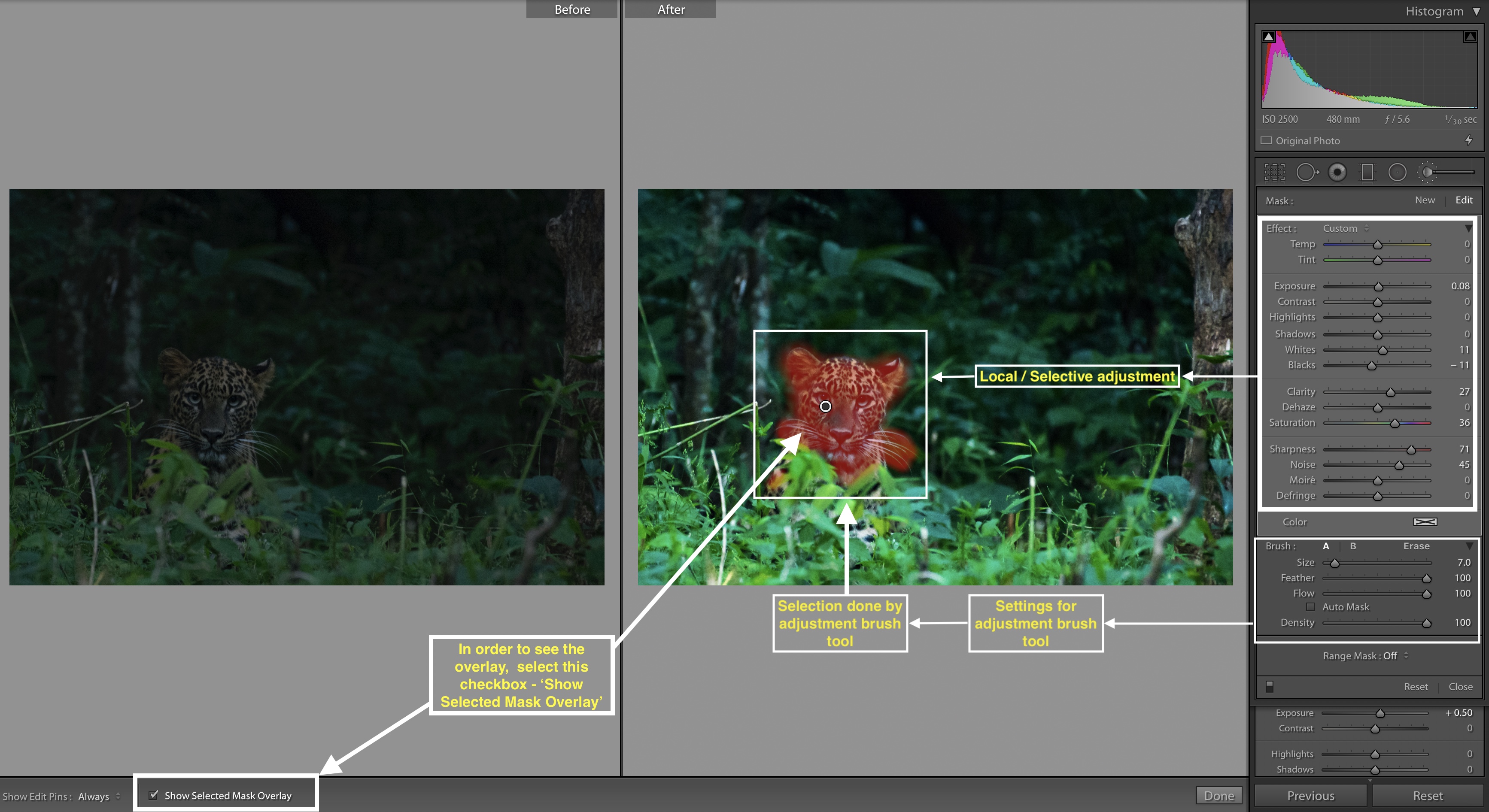
Select an adjustment brush. You will find 4 sliders – size, feather, fl ow, and density
( After selecting Adjustment brush, check the ‘Show the selected overlay’ option at the bottom. With this box checked you will be able to see how much area you are painting or selecting )
- Size defines the size of the brush which you will be
using for painting the selection area. For large and coarse area selection you can use large size. For smaller and finer area selection small brush size is required. - Feather option defines the transition between the area where adjustments are applied and
area where adjustments are not applied. In the Adjustmentbrush you will seethat , - Flow option controls with what intensity the adjustment is applied. Higher the flow percentage more the intensity of Adjustment is applied.
- Density essentially is an opacity of the adjustment applied. If you set the value to 30 % density, in that
case adjustment will not be applied for more than 30% opacity. If you set the density to 100 % then opacity of an adjustment is 100 %
There are no universal settings for these sliders. I recommend first you understand what each slider does a nd apply it to your image based on which area you want to make an adjustment.
Once you have painted ( or selected ) the area where you want to apply adjustments you can view the area by checking the box at the bottom of Lightroom Image window – ‘Show the selected overlay’. Great job! you have selected the area. It’s time to apply actual adjustme nts.
2) Application of actual adjustments –
Once you have selected the area, click on the Selection icon ( Circle). In the
We have used these slider for global adjustments as described in the article, similarly use these sliders for localized adjustments. Each image will demand various settings for each slider. Hence, feel free to use those slider and see what works for you image the best.
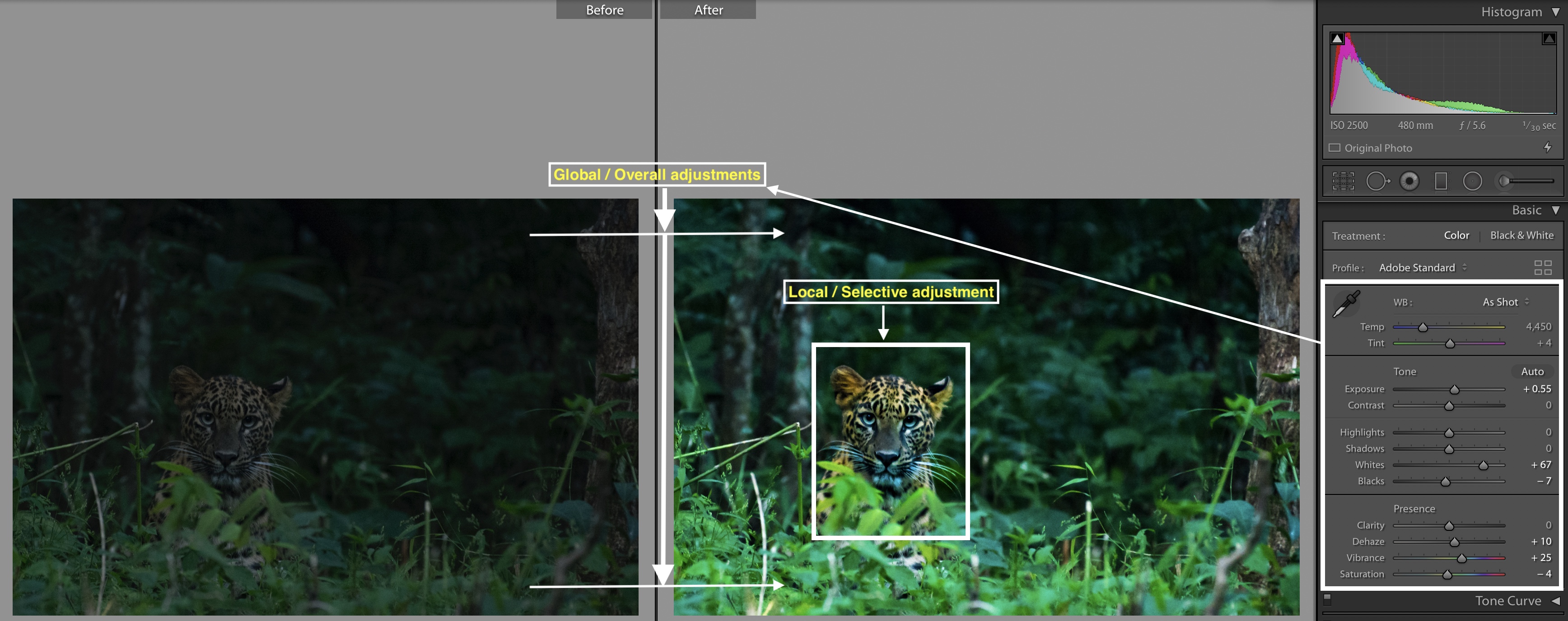
Note – Just make sure you don’t overapply the selective adjustments. You don’t want, your main object to look entirely different than the surroundings. Apply these localized adjustment to effectively bring out details in the main object and not to separate main object from the surroundings. Localized or selective adjustment works best with balanced approach.
Learn how to make Targeted adjustments effectively here
Targeted Adjustments in Adobe Lightroom
Image export
Once you have imported and optimized your images now it’s time to get those image out of lightroom and send it for print or share it with magazine or share it with your friends on social media.
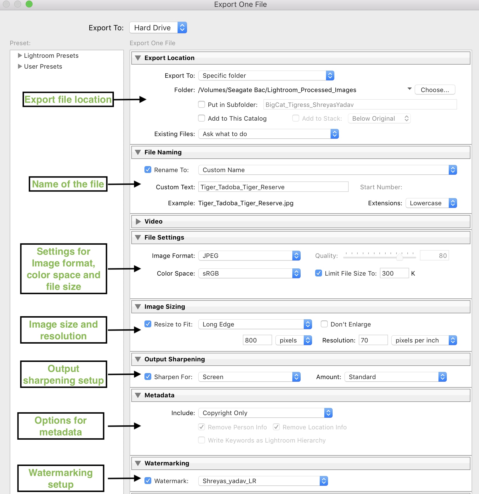
Image export is one stop tool box for exporting images out of Adobe Lightroom. We will see essential options in an Imag e export
- Export location
- File Naming
- File Setting
- Image Sizing
- Output Sharpening
- Metadata
- Watermarking
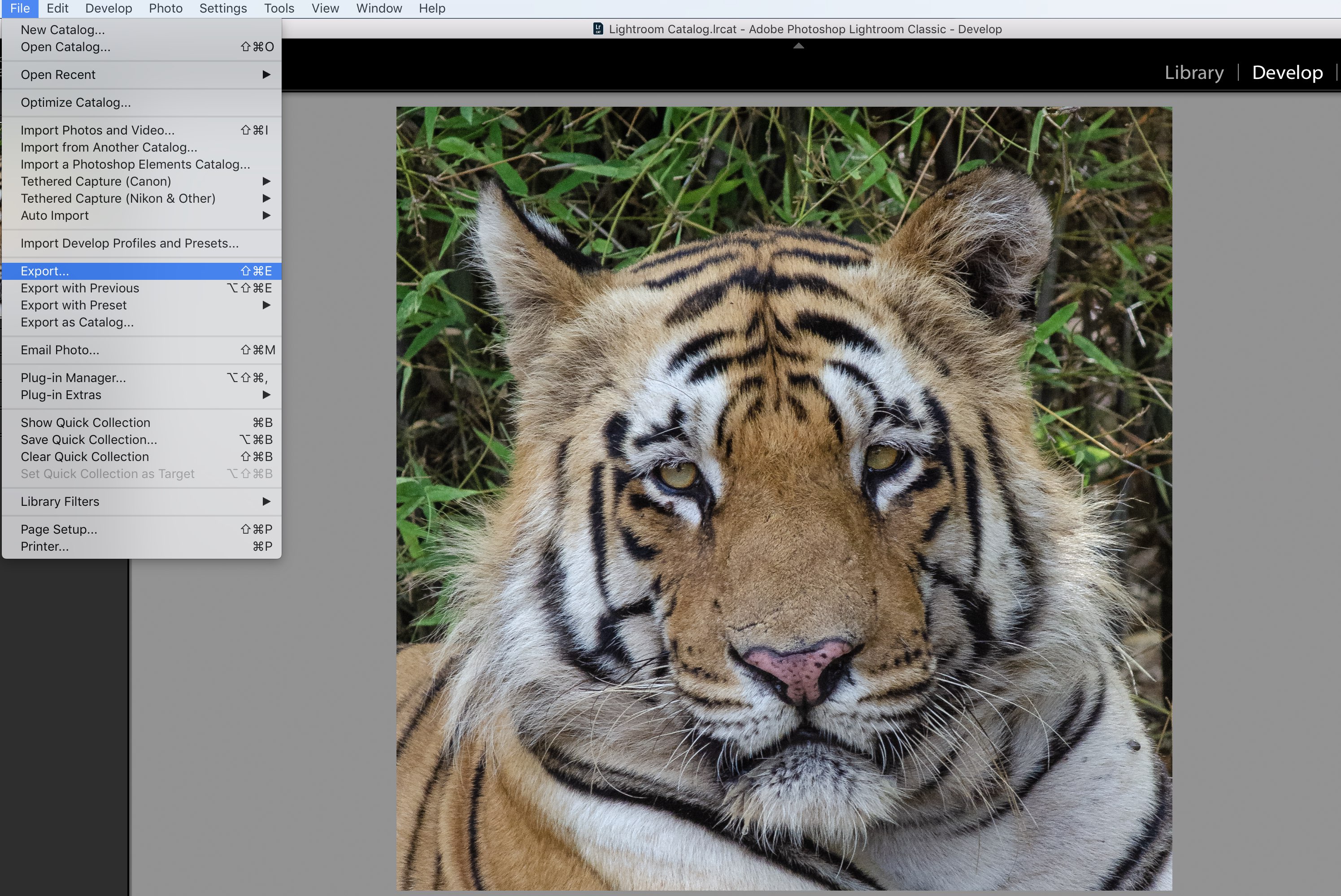
After you have processed an image in develop module of the Adobe Lightroom, go to File > Export.
- Specify where you want to export an image. You can select your hard drive and folder/ subfolder location
- Under the option of file naming, you can rename the file or keep the default name as an Image number
- With file setting, you can select what image format you want such as jpeg, tiff,
dng etc.( Mostly you will be setting it to jpeg ). Color space can be selected. I set it to sRGB. Image quality and Image sizeis also selected. For web version images I select Image quality greater than 80 % and Image size is restricted to 300 kb. For large images ( Prints / Magazines ) I selected quality as 100% and image size is restricted to 5000 kb ( 5mb ) - Image resizing – With Image resizing you can control long edge/short edge or both in terms of pixels /inch/cms. ( For web versions I keep the longest edge to 800 px and for large images
generally I keep the longest edge as 2000 px. But this is more of your requirement dependant ) . For webversion I setresolution to 70 pixels per inch and for prints, I keep it to 240 or 300 pixels per inch. - Output sharpening – While exporting an image, sharpening is applied using this feature. Output sharpening intensity can be applied as low, medium and high. Also, sharpening can be applied based on whether you want
export for prints or web version images. - Metadata – You can choose to associate the Image metadata with Image or it can be removed from an image. Image metadata increases file size. I usually remove Image metadata for reducing
size and only keep copyright option for an image. - Watermarking – Watermarking is used for adding your name, copyright symbol, logo or your website on an image. The best part of Lightroom watermark is that you can save your watermarking style as a preset. You can control the opacity, style, and position of the watermark with this option.
The steps mentioned in the article helped me to reduce my image organization and post-processing time significantly. Most important – I can control my image organization style and image optimization workflow effectively.
This huge saving in time has allowed me to save more time in front of
All these things you can do too! Like me , saving time in post processing will be helpful to you in multiple ways, such as – quick delivery to your client, you can take more clients, travel more, refine your photography skills, make more and better photographs, spend more time with you loved once after you had photography session.
Now it’s your turn ! Apply these techniques mentioned in this article and optimize your images. Which Lightroom technique you find helpful and significantly improved your image ? Write down in comments below
With Love and Passion
Shreyas
EXPLORE. PHOTOGRAPH. INSPIRE
JOIN OUR NEWSLETTER AND GET THE BEST ARTICLES ABOUT DIGITAL POST-PROCESSING AND PHOTOGRAPHY TECHNIQUES. NO CHARGE. NO SPAM. ONLY LOVE.
Very useful info for beginners
Hello Rajendra Dharashivkar,
Great to know it is useful and adding value to you.
Best regards
Shreyas