This article is a step by step guide on color corrections using adobe lightroom. Strategies discussed in this article will help you to master color corrections and get accurate colors while post-processing image in adobe lightroom.
A couple of years back, It was difficult for me to get accurate colors while post-processing an Image. I had been struggling to get my head around Adobe Lightroom just to get right colors in my images.
I was having a hard time editing the skin colors of newborns and portraits. I was seeing a strong yellow color cast in my nature and wildlife images. I was wondering how to get rid of it. In an image, the colors of the shirt were different than the actual colors of the shirt. I was clueless about how to identify and remove the color tint, green color reflection from the eyeglass. And the list goes on…
Does this sound familiar to you? Are you struggling how to master color corrections in Adobe Lightroom – here is your 7 step strategy to get accurate and intended colors after post-processing.
In this article you will learn how to get beautiful colors in adobe Lightroom.
In fact, I have used these exact steps to get accurate and beautiful colors in my pictures.
Today I will show you how I did it and
How you can do the same.
Let’s dive right into the 7- step strategy
- Image settings in Camera
- Monitor Calibration
- White balance setting – Tint correction and color cast removal using temp adjustment
- Vibrance and Saturation
- Tone curve
- HSL Slider – Hue, Saturation and Luminance slider
- Targeted color corrections
1. Image settings in Camera
Photographing accurate colors with large color space is the first step to capture correct colors. This is an important step. You will get accurate colors in the final image only if you capture maximum possible data in the camera.
Here are the settings and why you should do it
| Camera settings | Why you should do it |
| Image quality : RAW | To record maximum data in an image |
| Color space : Adobe RGB or Pro Photo RGB | To capture the wide color gamut |
| Bit depth to 14bit or higher | To capture maximum colors and gradient of colors |
| Raw loseless compression | Compression of Raw file without any loss in data |
| Picture setting to Standard or Neutral | It is possible to optimize a standard/neutral image. But difficult to make a standard/neutral image from deviated one. If you are shooting RAW – skip this point |
Do these settings in your camera and you are good to go
2. Monitor Calibration
Monitor calibration is critical when you view an image on your monitor or screen. You want to see similar colors on the screen and the way you actually saw it.
If you don’t have a calibrated monitor, there will be a difference in actual colors and colors on the monitor. In order to fix this issue, you should calibrate your monitor somewhere between every 3 to 6 months.
Monitor calibration is a simple process where colorimeter is used to calibrate the monitor. Color spyder pro or X-Rite Colormunki Smile are good tools for monitor calibration. Even though monitor calibration seems difficult, with the mentioned calibration tools the process is quite easy.
Steps for monitor calibration
- Place the colorimeter on your monitor or display.
- Connect the colorimeter to your system using USB
- Run the calibration software/wizard as per instructions on the screen
- You will see before and after calibration images as well
- And you are done with Monitor calibration
After monitor calibration is completion, you will see the colors which are close to actual colors. The colors in output image which you will be using for web or print will mostly match the actual colors.
3.White balance setting – Temp and Tint correction
There are different sources of light, such as sunlight, flashlight, bulb, and incandescent light. Each light sources have a specific color temperature associated with it.
Based on the light source, you will see a color cast in your image. The color cast will be of yellow or blue color. Where yellow represent warmer color temperature and blue cast represents cooler color temperature.
Using white balance – Temperature slider you can adjust the color temperature. For example in your image you see a yellowish color cast, then you will reduce yellow color cast by moving the slider towards blue.
Tint slider helps to adjust the green or magenta tint. If your picture has a green tint, then adjust the tint slider towards magenta. The more green tint you will take out, the magenta tint will be coming in the picture. Similarly, you can reduce magenta tint by moving the tint slider towards green.
Steps for adjusting white balance
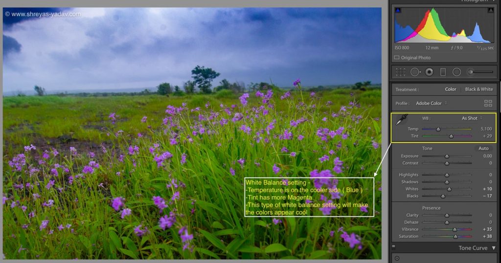
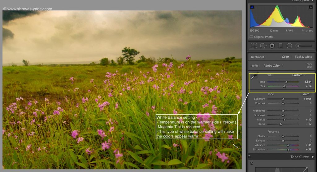
- In the Basic panel, there is a slider for White balance. It has 2 settings – Temp and Tint
- In the drop-down menu select White balance as an As Shot. This is a good starting point to adjust the white balance
- If the image has yellow color cast move the Temp Slider towards blue. If the image is appearing on the cooler side, move the slider towards yellow. With Temp slider, you can precisely control the white balance. Temp slider greatly helps to correct the color in an image
- Also, you can select the White Balance Selector tool ( Pen symbol ). After selecting the White Balance Selector tool find out the neutral grey area in the image. Select that area with this tool.
- Above mentioned methods are good for setting the right white balance. If your image has a neutral grey area then the white balance selector tool is decent to adjust white balance. If you don’t have a neutral grey area then adjust the white balance using the Temp slider as mentioned above
- After you have adjusted the Temp slider, next step is to tune Tint in the image. If green tint is dominating the image, you have to replace the green tint with magenta. Similarly, you can reduce magenta tint.
- Adjusting white balance is ultimately finding the right balance between warm and cool color temperature, also you will balance the tint in your image.
A white balance tool is a great tool in color correction. In this step, you will set up the color temperatures. Striking the right balance is the key to get accurate colors using the white balance tool.
4. Vibrance and Saturation
Vibrance and saturation sliders help to boost the colors. The intensity of the colors will be increased or decreased. These tools are critical in terms of color correction in Lightroom.
Saturation slider boosts all the colors in an image. Whereas Vibrance slider boosts the muted color in an image, keeping already boosted colors unchanged. This is the main difference between saturation and Vibrance slider. Selective boosting of colors is the main advantage of the vibrance slider.
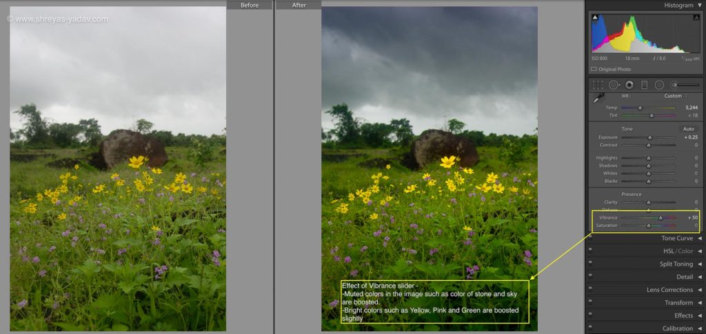
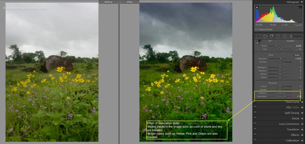
If you are adjusting the colors of skin tones in a portrait, vibrance slider is helpful. As with vibrance slider, you can preserve skin tones. But with saturation slider skin tones looks unnatural.
Steps for adjusting Vibrance and Saturation –
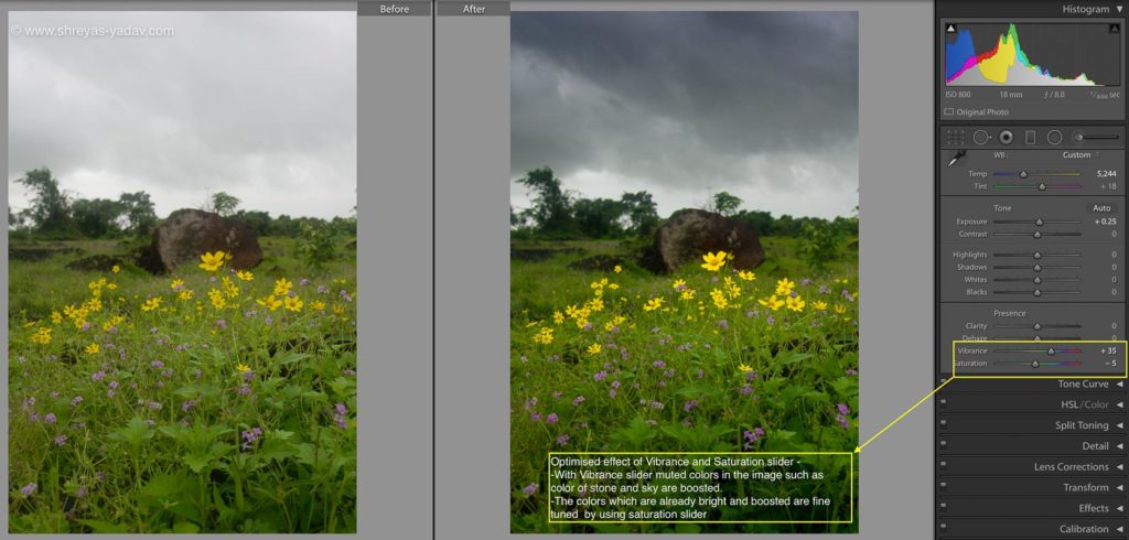
- In order to boost the colors effectively, you have to fine-tune both the sliders
- Vibrance and saturation are available in the Basic panel under Presence option
- First, increase the Vibrance by moving the slider towards the positive number. ( + 15 to +25 are good starting numbers for Vibrance slider ) The colors which are less intensive or muted will be boosted.
- There are certain colors which might get an over-boost. To adjust those colors move the saturation slider slightly towards the negative number. ( – 2 to -5 would be good value to start with )
- Start with this approach and you will come up with specific numbers for your image and taste. Numbers of Vibrance and Saturation slider might change but this concept will help you to effectively boost the colors.
5. Tone Curve
The Tone curve is an effective and precise tool for adjusting the tonality and make color corrections.
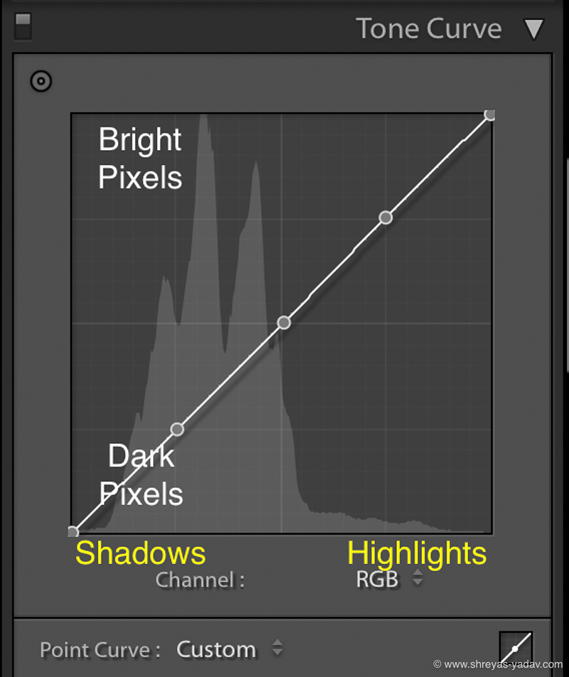
Tone curve template is located below Basics. The tone curve is a representation of RGB pixels in an image.
How to read tone curve
- On the X axis, the left side represents Shadows whereas right side consists of Highlights. Center on X axis has mid-tones
- On the Y-axis top area consists of bright pixels. The bottom area represents dark pixels.
How you can use tone curve in post processing
- you can use Tone curves to adjust the tonality of an image ( Brightness, darkness, shadows, and highlights)
- With a tone curve, you can do color correction selectively under the darker or brighter area. For a brighter or darker area, you can precisely control the RGB colors.
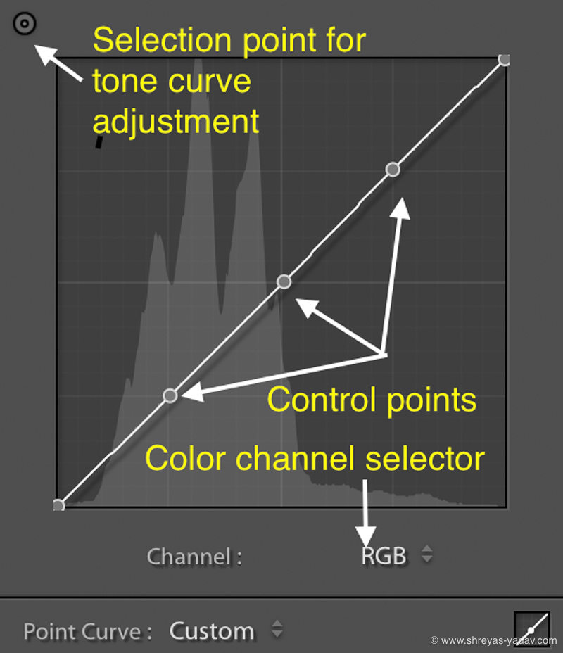
You will learn how to do color correction using tone curve.
Remember
- Opposite of Red is Cyan
- Opposite of Green is Magenta
- Opposite of Blue is Yellow
If you try to reduce Blue color, then Yellow color will be visible and vice-versa. Same applied to Red and Green colors as well.
Steps to color correct using tone curve
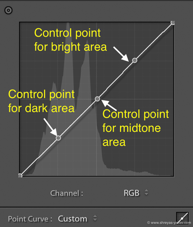
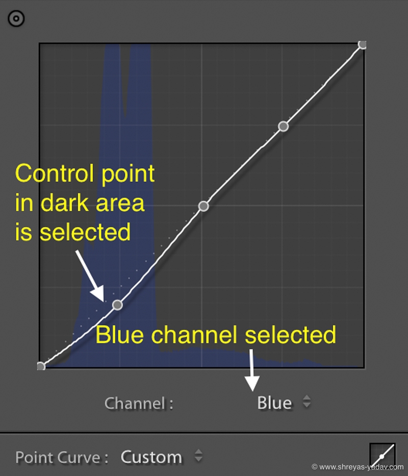
- Identify which color you want to fix . If it is Blue or Yellow then select Blue from drop down
- Identify in which area you want to do color correction. You may want to fix the colors in bright , mid tone or dark area of an image.
- For example you want to work in dark areas of the image, then click on the cursor at lower left square
- If you want to increase the Blue color then drag the curve upwards. If you want to reduce Blue or introduce Yellow color then drag the curve down
- For adjusting the color in midtone, select the center of the square
- For brighter and highlight areas select the point in upper right corner
- Similarly you can do color corrections in mid tone and brighter areas of the image.
- Here is an image which shows how you can select the color. It also shows areas of Highlights, midtones and shadows.
6. HSL Slider – Hue, Saturation and Luminance slider
HSL is a set of sliders for various colors which controls Hue, Saturation, and Luminance.
Hue – Hue slider helps is setting up the shades of the color
Saturation – Increasing saturation boosts up the color while desaturation can make the colors dull.
Luminance – Increasing luminance of color makes the color appear bright. On the other hand, reducing luminance will make color to appear as dark.
In the HSL panel, primarily there are eight colors. For each color, you can control Hue, Saturation, and Luminance independently.
How to use HSL sliders
By default all the sliders are set to 0 . Moving slider towards right ( Positive number ) will increase the Hue, Saturation and luminance . As you drag the slider towards left ( Negative number ) Hue , saturation and luminance will be reduced.
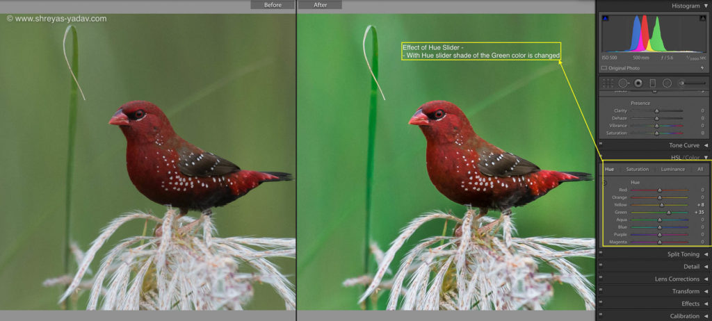
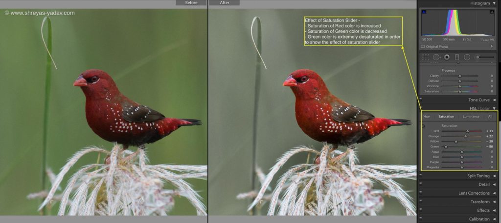
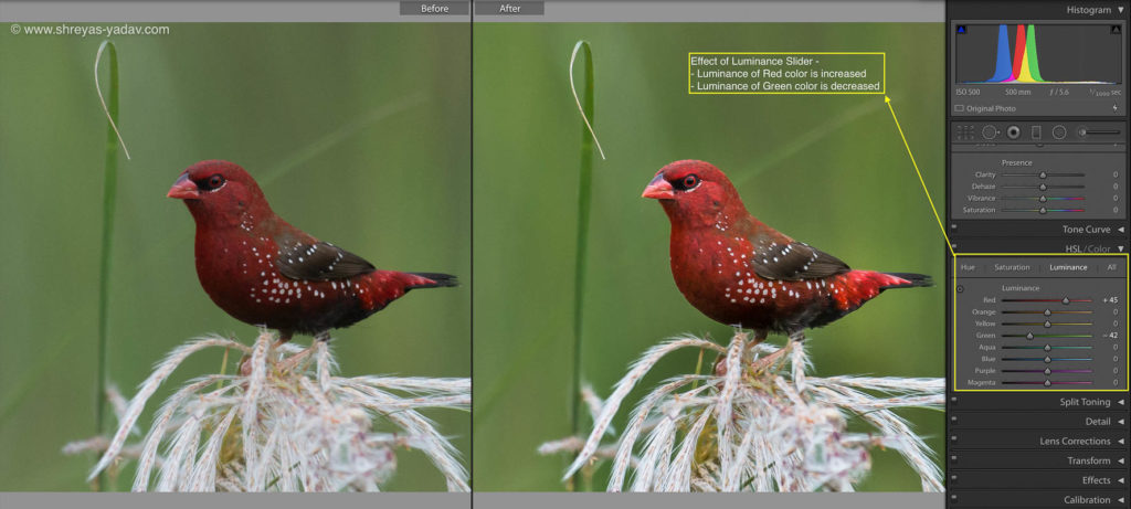
Second method is to select the color picker icon (circle icon) in the each slider and click on the color of an image which you want to adjust. Click and move cursor upwards ( Positive number ) or move the cursor down ( Negative number ). The positive number increases the H/S/L effect where as negative number decreases the H/S/L effect.
Here are some of the steps which I follow while using HSL tool box.
- In most of the cases, my camera will capture the colors accurately. Hence I rarely touch the Hue slider. Check your image, and if you see that the color shades are shifted then you can tweak the Hue slider for that color slightly.
- Whichever colors you want to boost specifically, increase the saturation of that color using sliders ( or using color picker tool ). Similarly, you can mute some of the colors by applying desaturation for those images.
- Evaluate which are the main colors for your object. Increase the luminance for those colors. Also, you can reduce the luminance for the colors which you want to be dark.
These are good starting points for you. Start here and tweak your HSL sliders as per visual appeal of an image.
7. Targeted Color Corrections
In addition to the Tone Curve and HSL slider, You can apply Targeted color correction by three methods described below
- Graduated filter
- Radial filter
- Adjustment brush
Fundamentally there are two steps to apply targeted color adjustments
- Select an area where the color adjustment needs to be applied
- Apply the desired color correction to the specific area
- Graduated filter
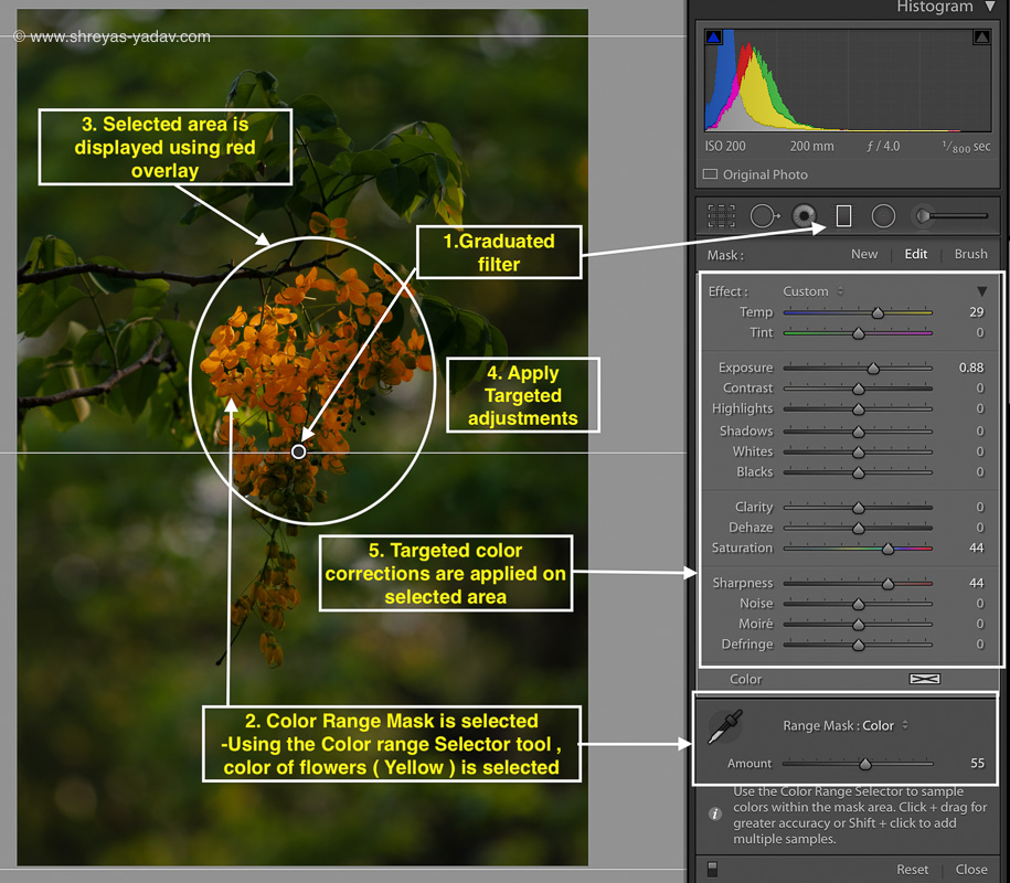
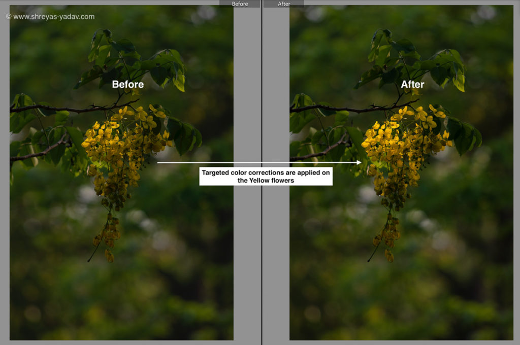
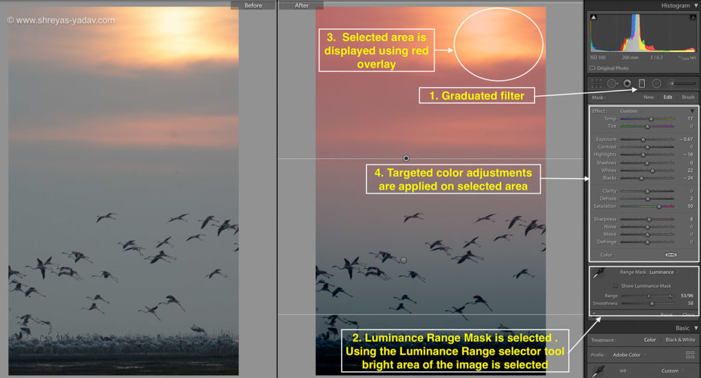
- Select graduated filter and apply on the required of an image
- After applying the graduated filter click on Range Mask drop down option
- Under Range mask, you will see Color or Luminance option
- A color option allows you to make a selection of an area based on colors. On the other hand, the Luminance slider helps you to make a selection based on Luminosity
- A general rule of thumb is – Image with various colors and even luminosity will need Range mask as a Color. For images with significant luminosity difference such as Clouds and dark foreground in that case Range mask as Luminosity is a good option
- Once you select Range mask as Color then with Color range selector icon you can choose the colors which you want work with. With color range selector you can adjust the amount of color selection using amount slider.
- If you are selecting based on Luminosity, with Luminance range selector tool select the desired area. You can specify a range of luminosity as well and smoothness of gradient.
- Once the selections are made based on either Color or Luminosity click on the checkbox below – ‘Show Selected Mass Overlay.’ You will be able to see what selection you have made and you can fine tune it if required.
- After a selection is complete, you can apply color corrections such as Temperature, Tint, and Saturation adjustments.
2. Radial filter
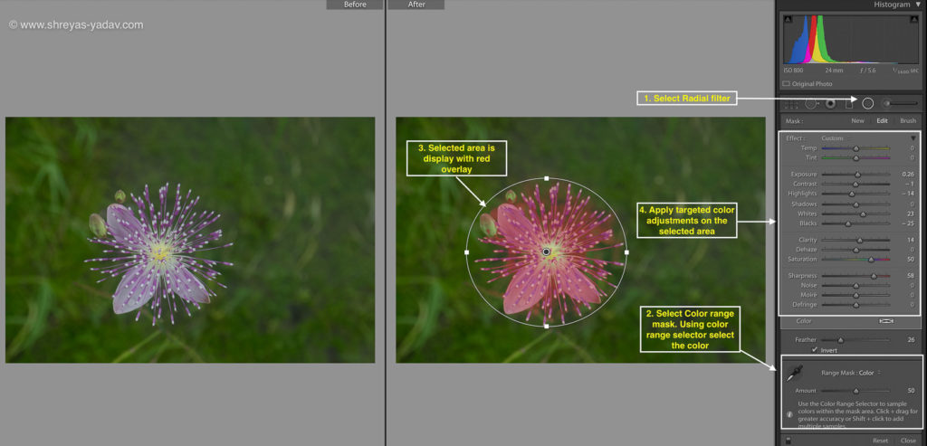
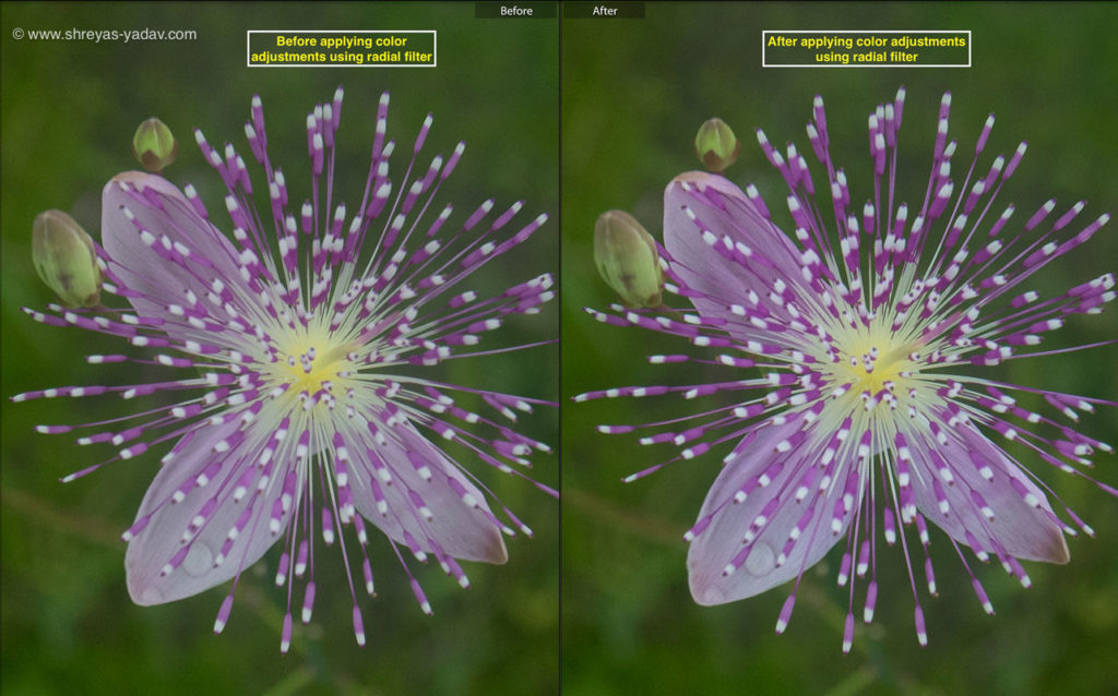
- Select the radial filter and apply on the required area. One advantage of the Radial filter over graduated filter is you can invert the selection.
- Once a radial filter is applied to select the area where you want to make a selection. Either it will be inside a radial filter circle or outside of the radial circle. This selection can be made by using Invert checkbox
- Similar to Graduated filter select either color selection or luminosity selection.
- Using color or luminosity selection select the area you want to color correct
- Apply color correction to the area selected. You can adjust temperature, tint, and saturation along with other adjustments
Workflow to apply Graduated filter and the Radial filter is the same but the application of each filter is different and depends on the image.
The graduated filter is particularly helpful in landscape images. As in landscape images foreground, object and background are distant and distinguishable.
A radial filter is useful in portraits, close up images and macro shots. Where the foreground, object, and background are very close to each other radial filter is a handy tool.
3. Adjustment filter
On contrary to graduated and radial filter, adjustment brush allows you to select areas manually. You can paint in the area you want to select or erase on the area which you don’t want.
Adjustment brush consists of 4 sliders – size, feather, flow, and density
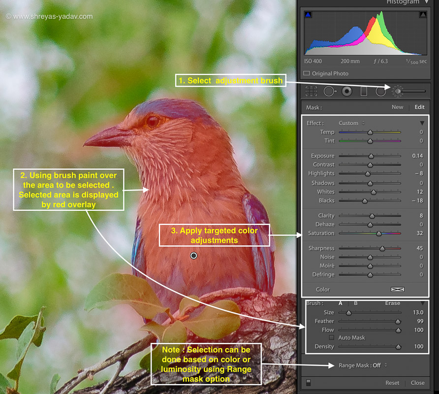
- After selecting the Adjustment brush, check the ‘Show the selected overlay’ option at the bottom. With this box checked you will be able to see how much area you are painting or selecting
- Size defines the size of the brush which you will be using for painting the selection area. For large and coarse area selection you can use the large size. For smaller and finer area selection small brush size is required.
- Feather option defines the transition between the area where adjustments are applied and the area where adjustments are not applied. In the Adjustment brush, you will see that there are two circles and the distance between two circles defines the feathering. Higher the feather value the transition will be smoother.
- Flow option controls with what intensity the adjustment is applied.
- Density essentially is an opacity of the adjustment applied.
- Once the area is selected using adjustment brush, Range mask can be used for color based or Luminosity based selections. ( Same as Gradient and radial filter )
My recommendation is first to understand what each slider does. Then based on your image select an area for an adjustment. This slider doesn’t have universal setting hence see what works for that particular image.
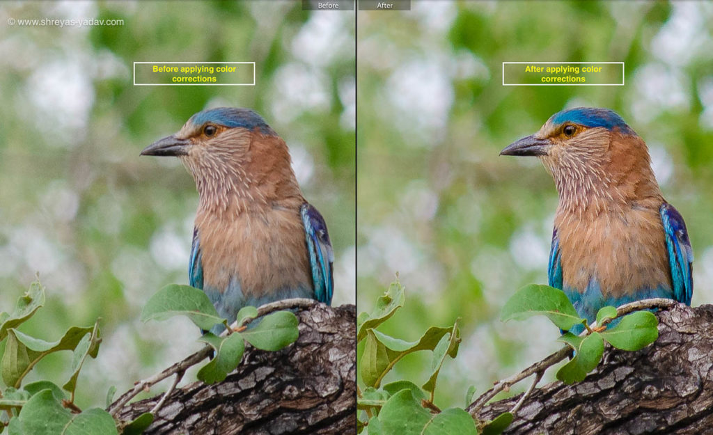
Once the selection is made with the use of an adjustment brush tool, then apply selective color adjustments such as temperature, tint, and Saturation.
To summarize here are the essential steps for you to effectively color correct an image.
- Capture the image is right color settings in the camera
- Calibrate your monitor or laptop screen
- Do global color corrections
- Apply local color corrections
As you follow these steps, you will master the color correction in Adobe Lightroom. These tips will help to get beautiful colors every time you process the image.
Now it’s your turn! Apply these techniques and get beautiful colors in your images.
Which Lightroom technique you find helpful and significantly improved colors in your images? Let us know in the comments below.
If you find this article helpful, remember to share it with others on Facebook and email
With love and passion
Shreyas
EXPLORE. PHOTOGRAPH. INSPIRE
JOIN OUR NEWSLETTER AND GET THE BEST ARTICLES ABOUT DIGITAL POST-PROCESSING AND PHOTOGRAPHY TECHNIQUES. NO CHARGE. NO SPAM. ONLY LOVE.
Useful info. This is a very good article to take the processing to the next level.
Thanks Shreyas for penning down your hard earned experience in a very structured form for your readers.
Thanks
Finally an article that explains LR attributes in a simple and practical way, thanks!
Thank you.